Reel Facts Booklet Layout: Movie Trivia “Spread” out
Introduction
The task was to create 10-page spreads that each convey information from a movie that was released in a specific decade. Two spreads for each decade spanning from the 70s to the 2010s with information about their release date, director, other films from that director, main actors, synopsis, 5 facts about the film, and a pull quote.
Requirements
– Gather information for the body copy
– Create a grid layout for items
– Curate imagery
-Pull quotes
– Format layouts
– Create a cover and TOC
Information gathering
Using IMDB, a website that hosts a large amount of information related to and regarding the movies. IMDB supplies the synopsis, director, actors, facts, bloopers, and frame captures which are all organized in an easy to locate manner. we gathered the information to be used in the body copy while considering the imagery that would then be paired with the body copy.
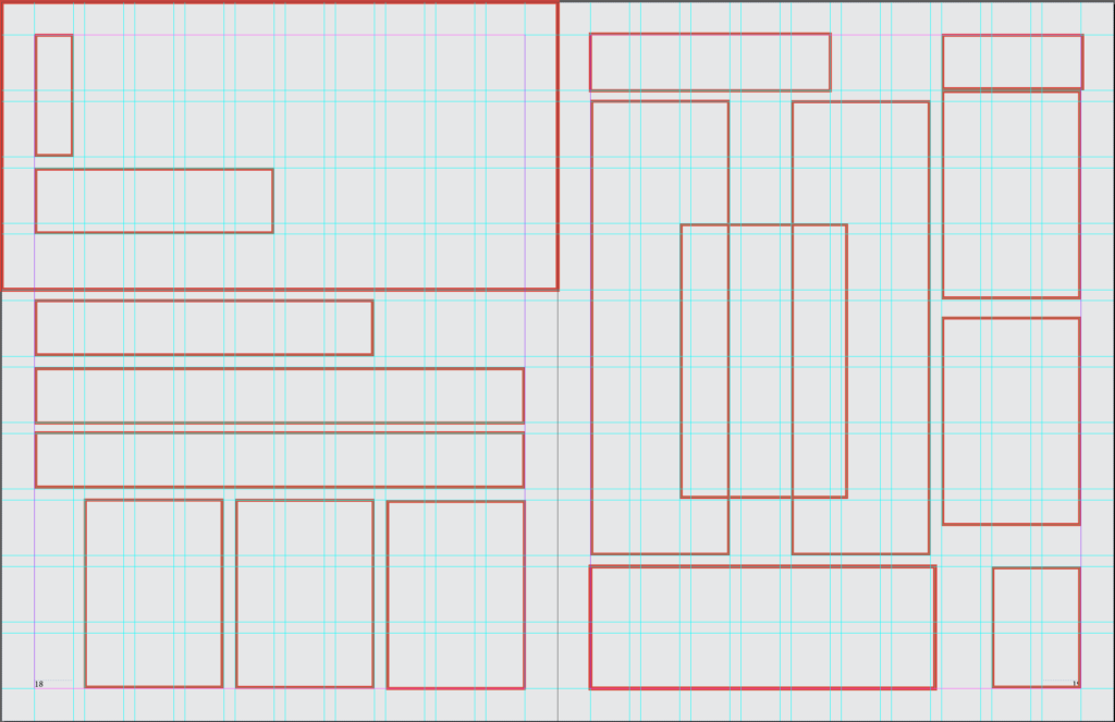
Grid Layout
In organizing the content into the spreads, we created a grid that would allow items to be placed neatly in alignment whilst still holding weight and visual interest on the pages.
Imagery
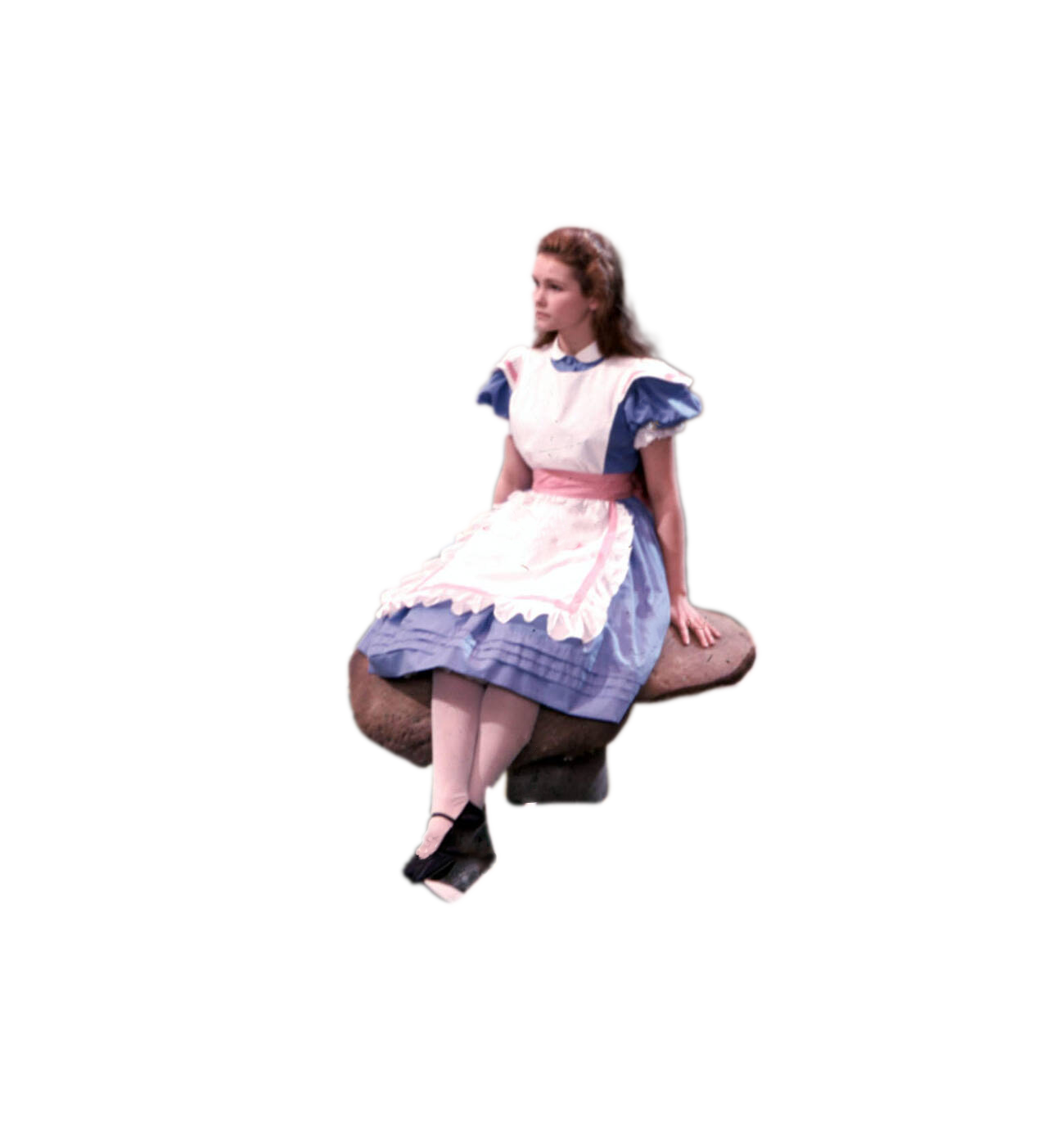
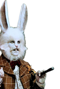
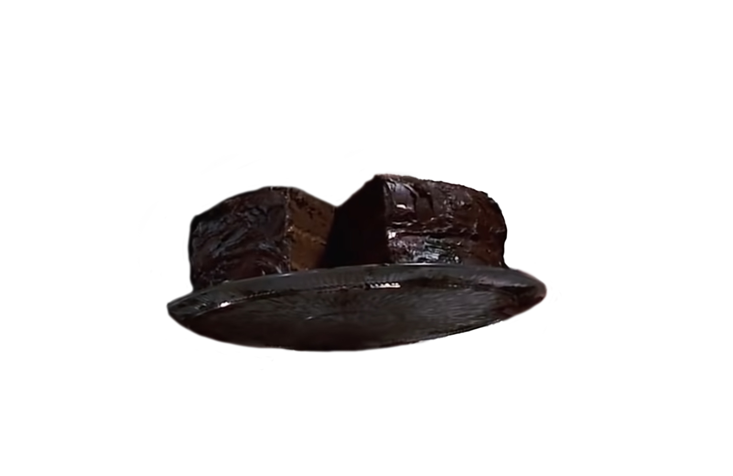
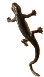
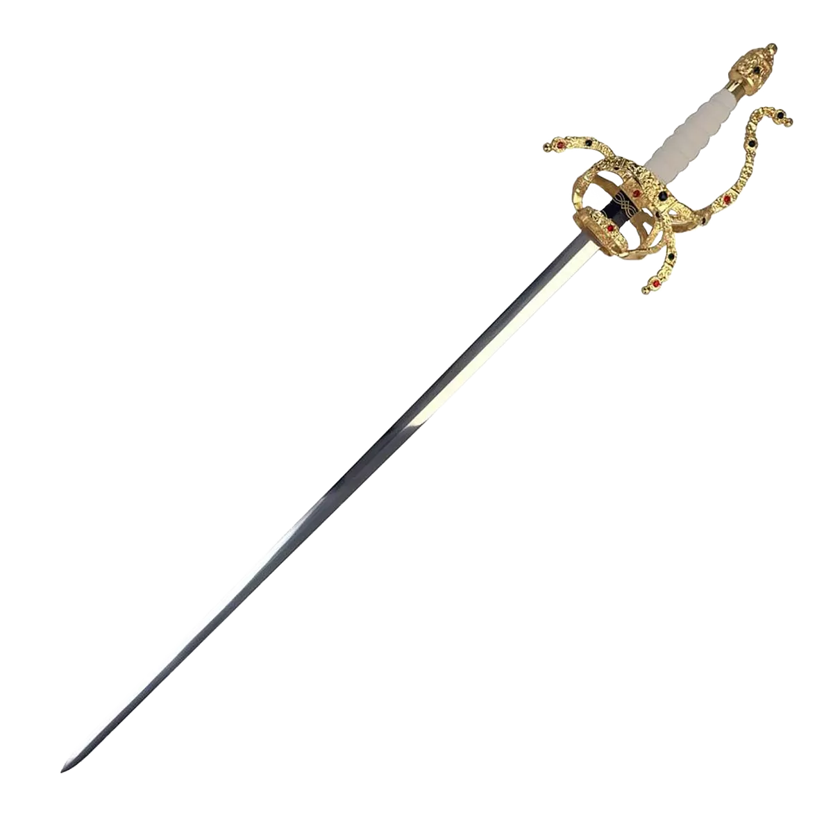
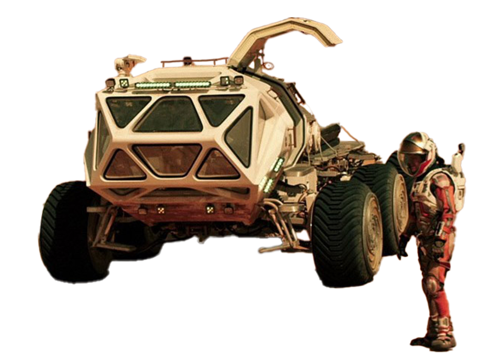
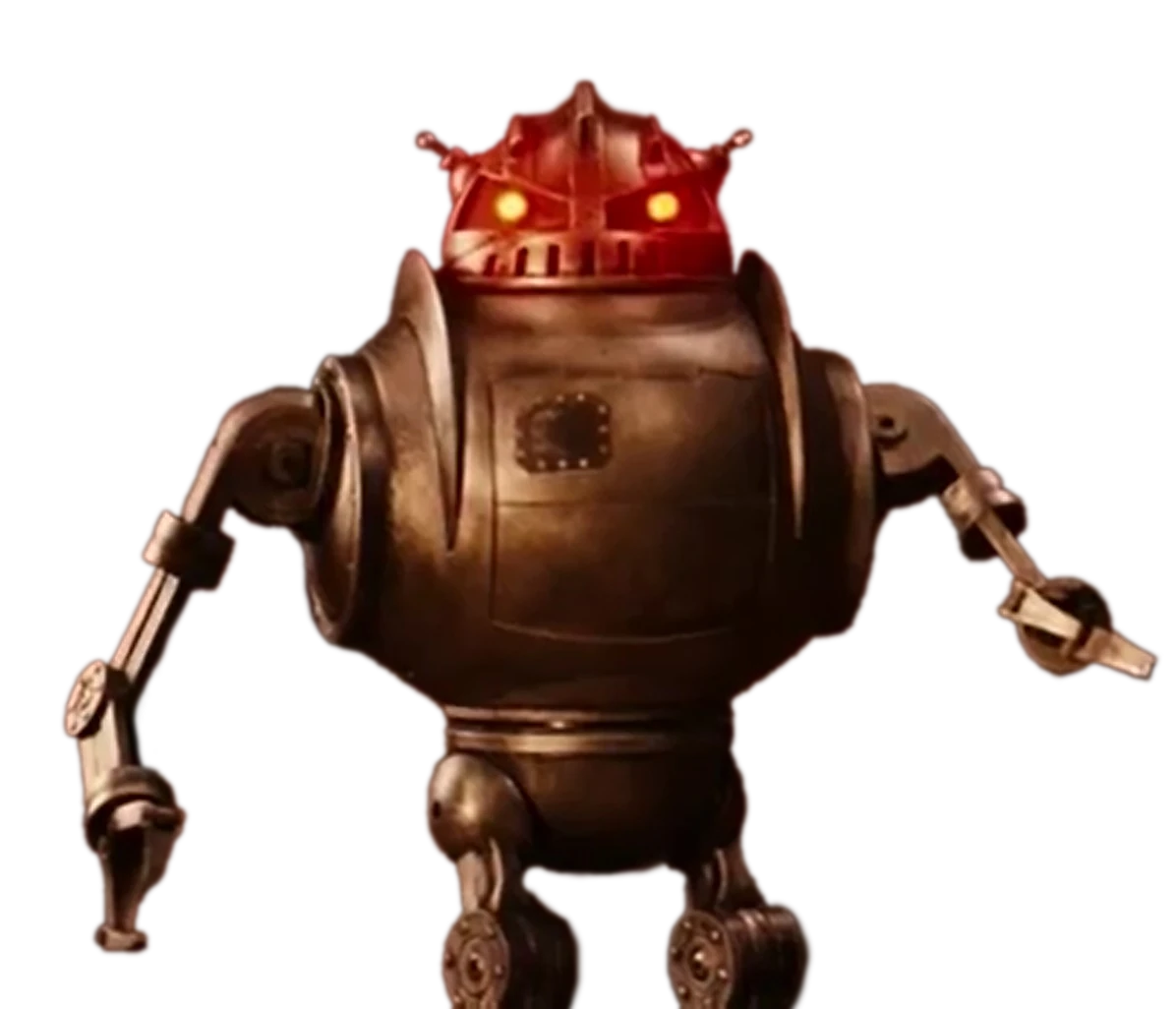
In creating the imagery, we found shots from the films online of high resolution through google as well as through Shot Deck which is a site that has high resolution frames from a large selection of films. With the images we then cut out the main subject to be used as a text wrap on the layouts. Additionally, there are icon files and vectors that I downloaded or created to add visual interest to less filled sections of the spreads.

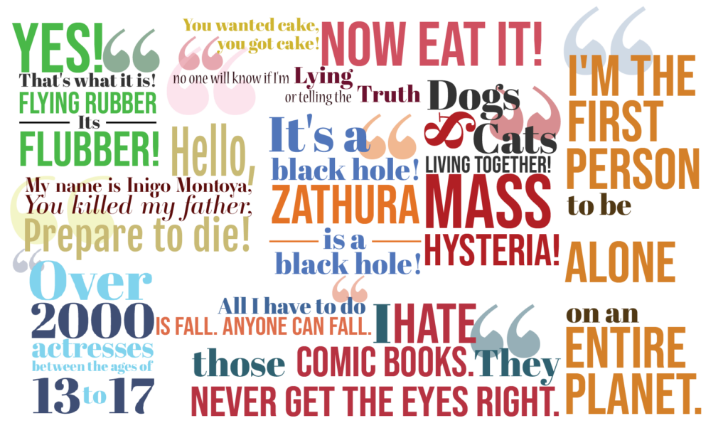
Pull Quote’s
Using adobe illustrator, we arranged quotes in a fun to read manner that emphasized how they were spoken, they pull colors from or related to the film and its imagery to add a pop to the layouts that doesn’t stray too far from the color scheme of the film.
Layouts
The layouts follow the established grid with general movie information being portrayed on the left as listed items with a single set of paragraphs for the synopsis, all located under a main banner image for the film; all the left pages follow this layout with a caveat for pages with shorter synopsis’s having images fill in the space.
The right pages follow two layouts, one having the filmstrip motif run across the top of the page and the other down the right edge. The book alternates between the two layouts to keep the book interesting and still formatted properly. On the pages are the fun facts, the other films, and the pull quote. Based off where the motif was the item’s locations shifted to make the best use of the space provided while still considering the hierarchy of the text and imagery.