Marketing to the Gen-Z Market
Introduction
Among the vast amount of energy drinks existing today, we were Tasked with creating an energy drink refresher brand that is unique and stands apart in the growing market. The brand will inhabit a whitespace in the market by addressing health concerns that are often overlooked by existing brands, this will help the brand stand out and be well received by the Gen-Z audience.
Project
-Research target audience
-Design logo & brand assets
-Create comprehensive packaging campaign
-Establish brand extensions
-Produce social media posts and advertisements
-Deliver brand video & booklet
Target Audience
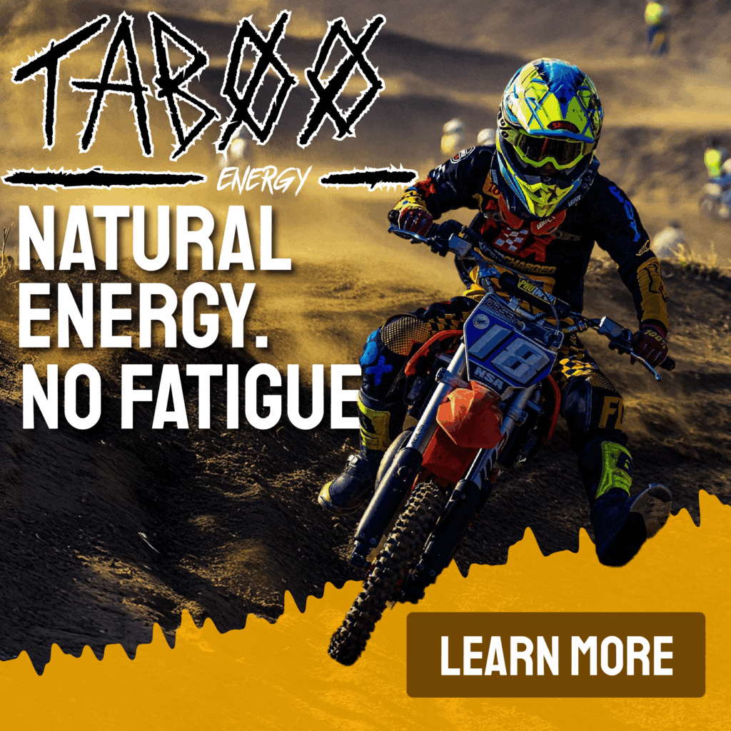
Taboo drinkers are the youth of Gen-Z, a health concerned and morally driven group who looks for authenticity in brands. These individuals look to Taboo to assist them in their busy schedules without worry of crash or fatigue. Taboo energy is branded with high-energy activity in mind, also striving to energize our athletes who in turn show our rebels how far a little “Taboo” can take them.
Logo Design
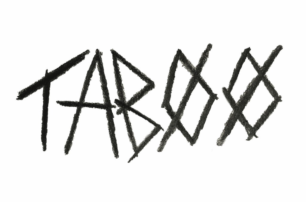
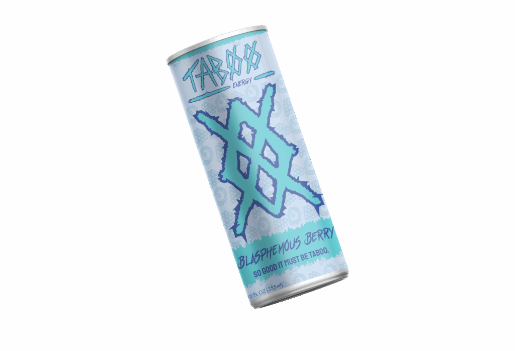
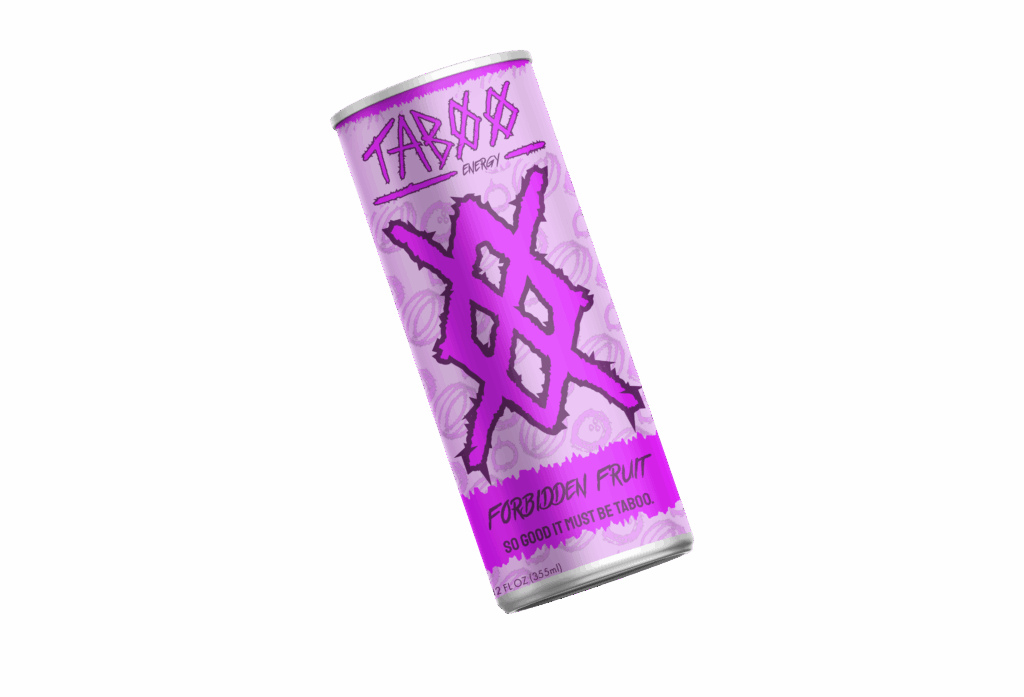
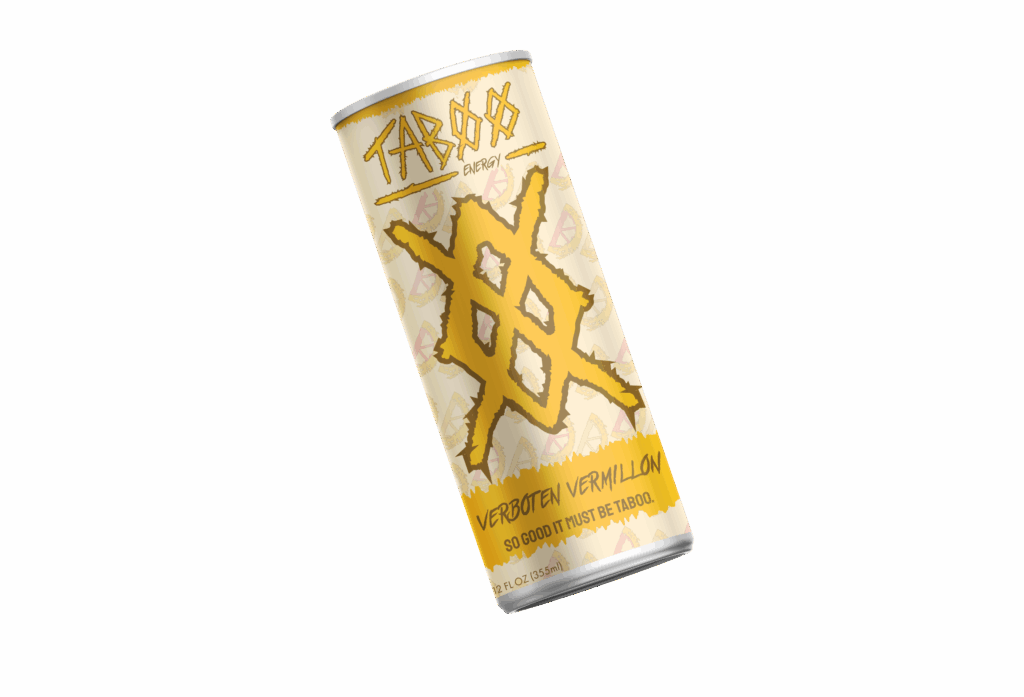
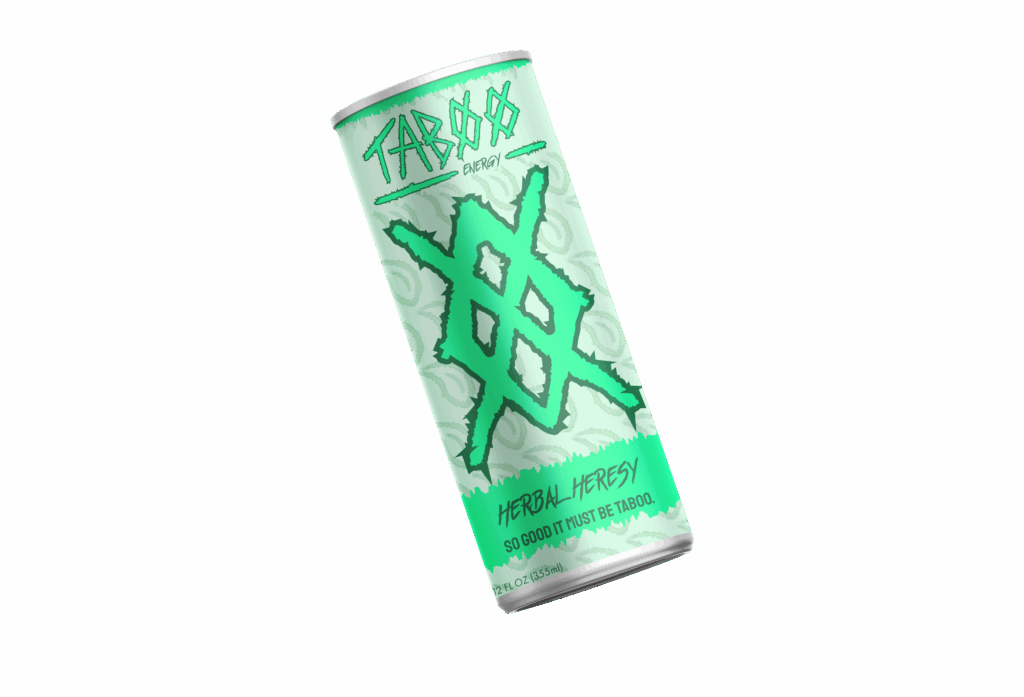
When first creating and ideating on the energy drink brand a name was needed. We wanted something short and snappy but rebellious as well. In using a small research group we found that Taboo was the best fitting brand name. Snappy and has a punk/ rebellious undertone that stands out from the market whilst following audience trends.
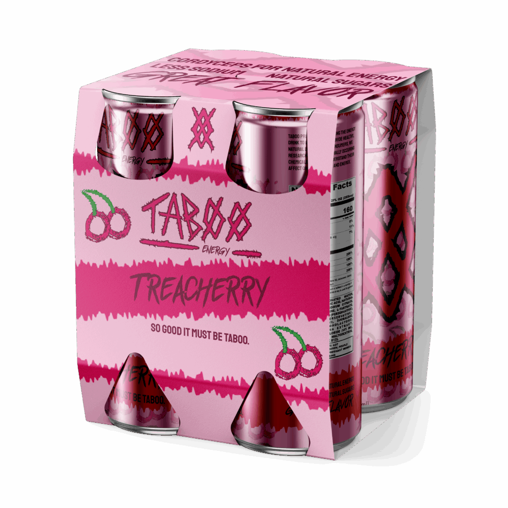
The sketch is the first rendition of the type logo for Taboo, showcasing a rough edgy all caps typeface with the O’s stylized to be prohibition symbols.
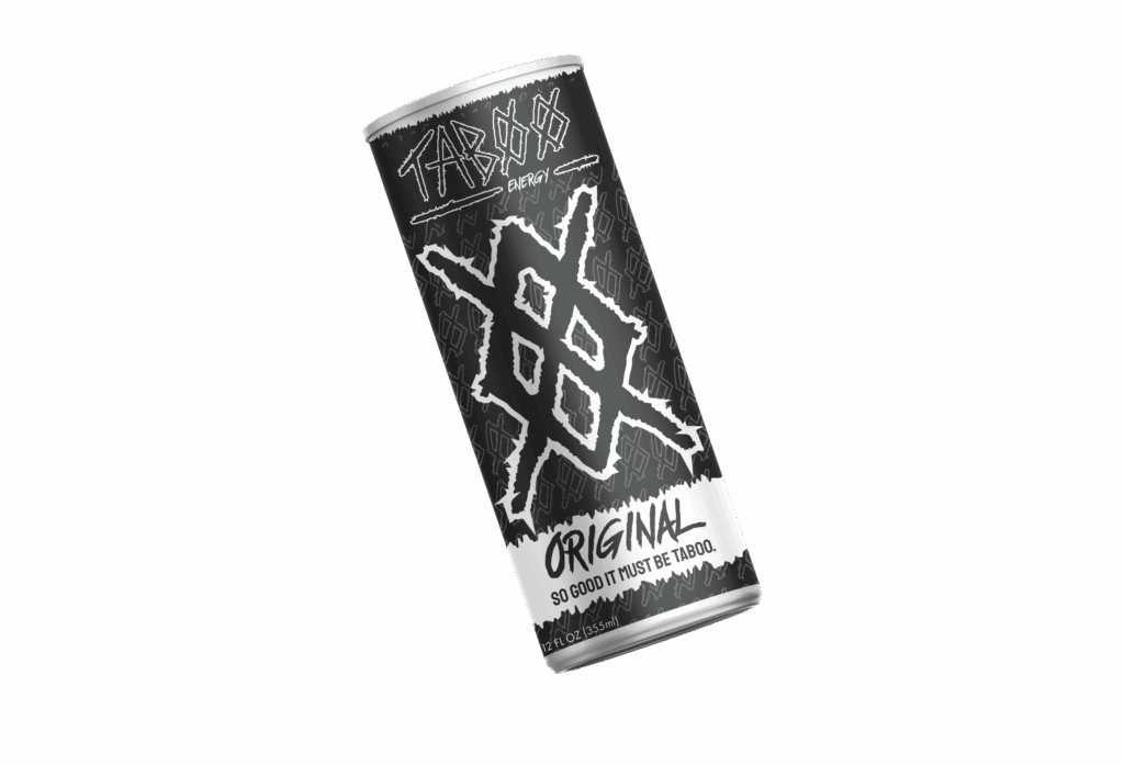
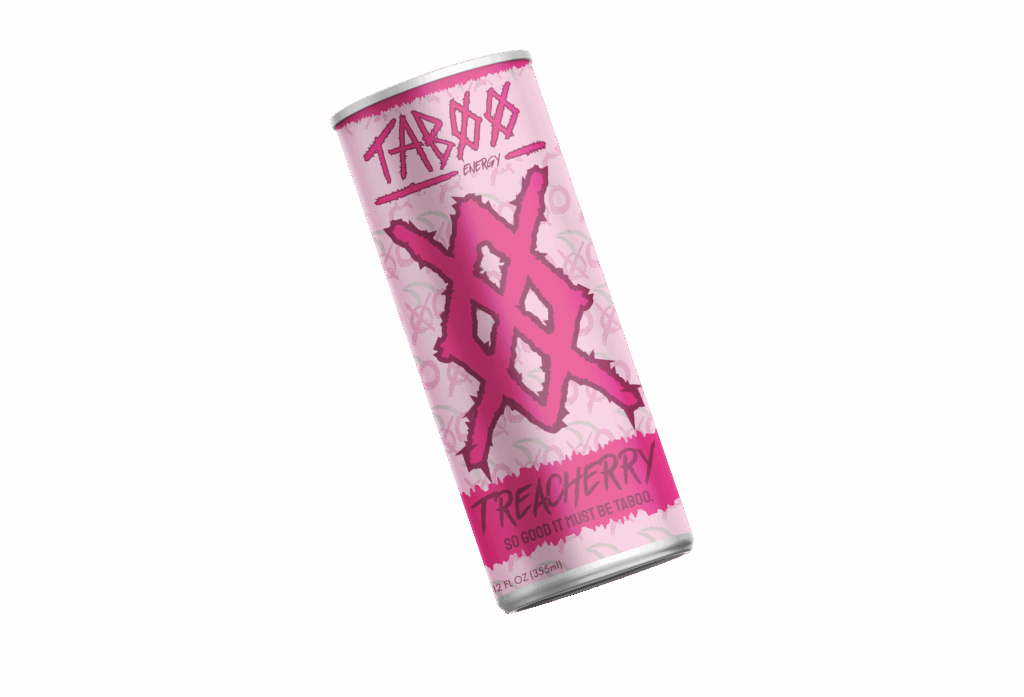
Using the sketch to create the vector logo we roughened up the edges and added an underlining element to fit the subtext energy, establishing an area that describes the brand or brand extensions. The colors chosen are high contrast saturated colors that pop and have an energetic feel. Each color logo variation represents a different flavor of the Taboo energy drink refresher.
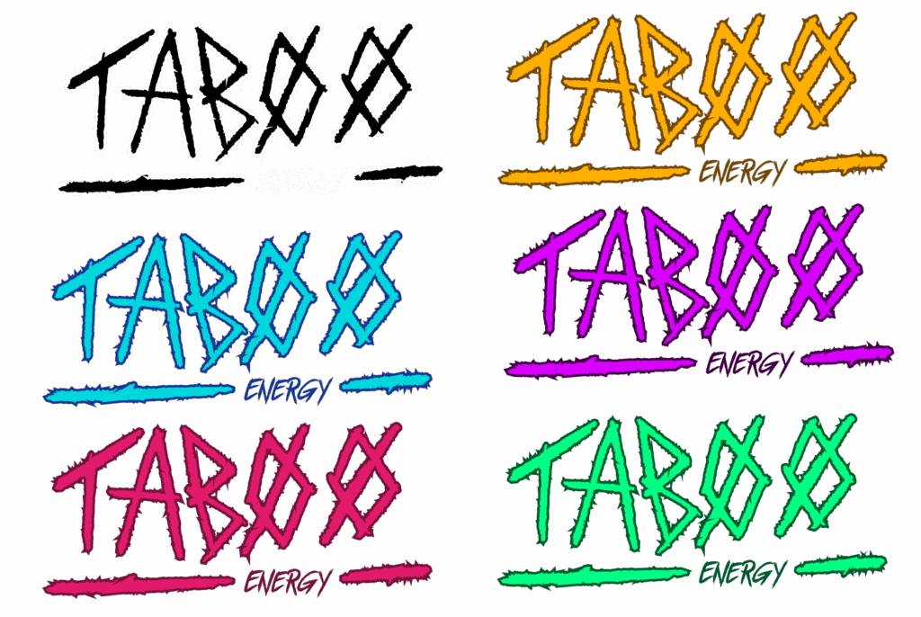
The Taboo icon pairs with the logo and the two are used independently or together. The icon showcases another stylized O shape except double crossed off, a homage to the two prohibition signs in the word mark. The icon shares the type’s aesthetic as well as being bold and strong brand identifier.
Packaging
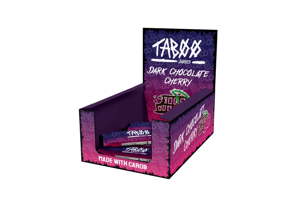
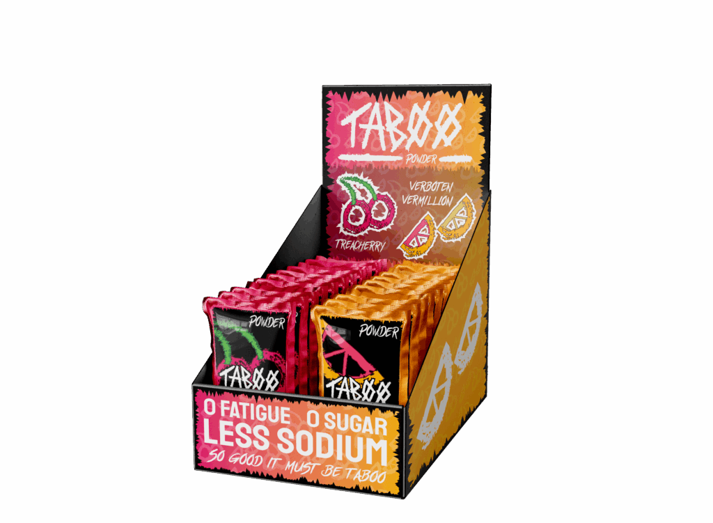
Brand Extension
The brand extension allow the brand to be about more than just drinks but a lifestyle by allowing customers to make use of different products that both specialize the brand to them as well, allowing the audience to engage with the brand in a way that feels meaningful.
Social Media Posts
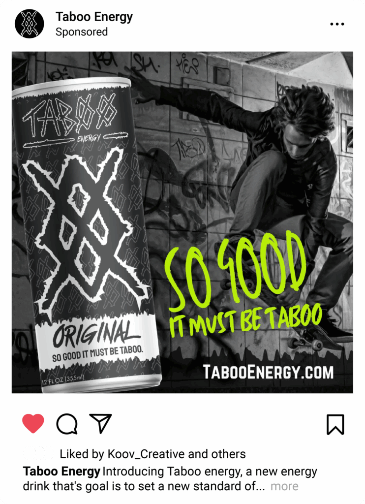
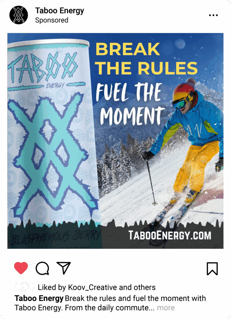
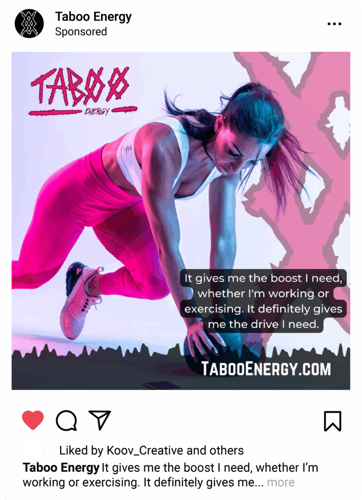
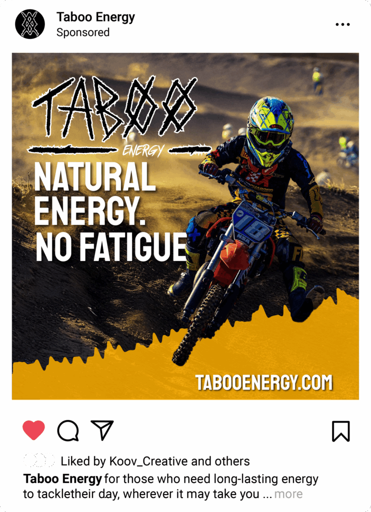
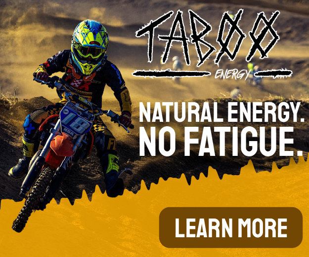
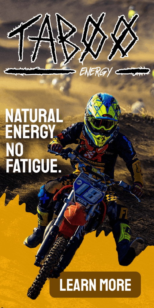
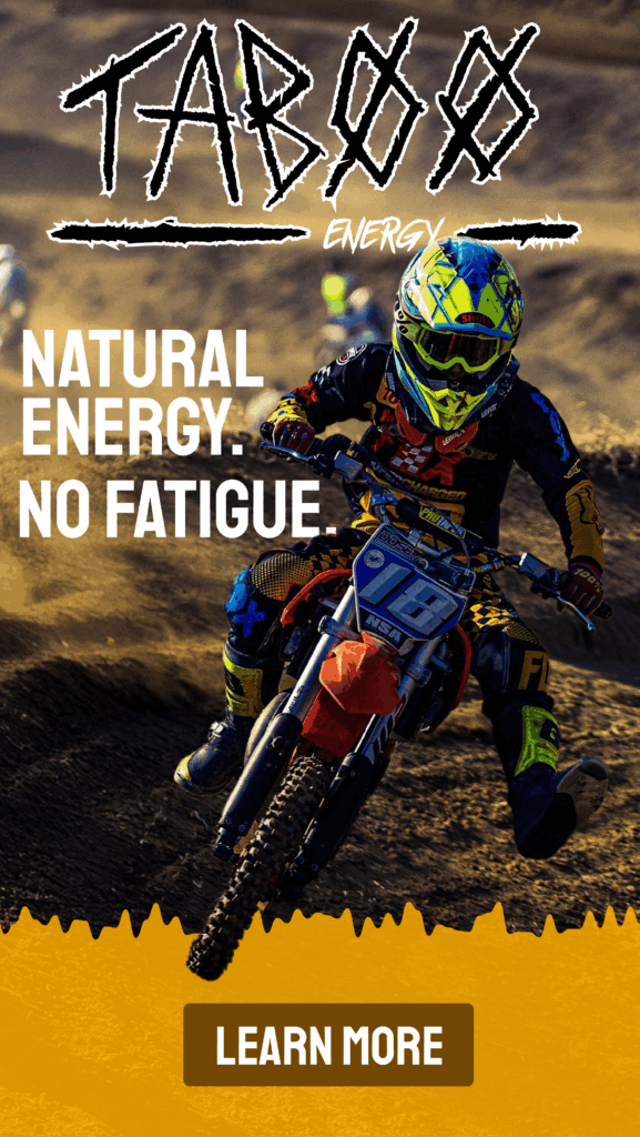
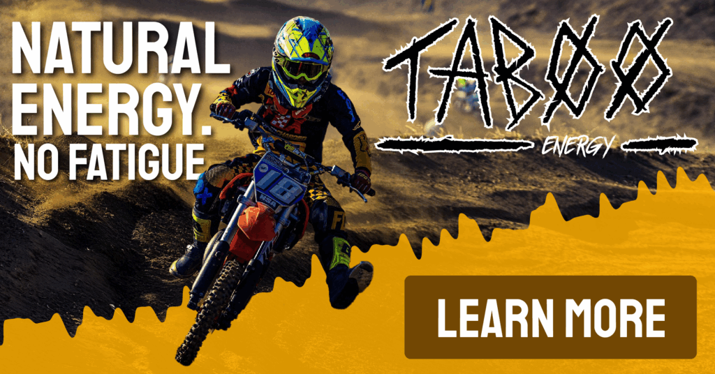
Digital Advertisements
A collection of digital ads created at different aspect ratio’s for placement and use online.