Branding for an Escape Game Industry
Introduction
In expanding our horizons we’ve decided to create a mock escape room brand that would be able to stake a spot in the market of RI’s entertainment facilities among already existing escape room brands. In the creation of this brand the aesthetic and feel of the brand and its offerings must hold a cohesive theme that resonates with the typical audiences of escape rooms in addition to having offerings that allow the room to stand out among its competition. This project was to be completed in 10 weeks time.
Project
-Concept brand name
-Design logo
-Prepare branding booklet
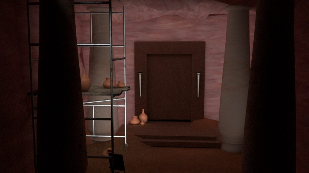
-Build and render 3 escape rooms
-Create trifold brochure
-Deliver business cards
-Port 1 escape room as an AR experience
Brand Name
When choosing the brand name for our escape room brand we researched and evaluated keywords that apply to the genres and services of escape rooms. Many of our options for verbiage were eliminated by existing brands using the words or something similar. Upon thinning out our options we came to the name Lockpick Labs; seldom used in other brand titles and still refers to the idea of escaping or breaking out. The “lab” segment we though fit because it makes the user think of a test or trial tying furthering into the business’ function.
Target Audience
The audience for Lockpick Labs is Rhode Islanders from the ages of 18-28 and is catered to group experiences and social outings. Giving players the opportunity to problem solve with their friends and family during the roleplay experience.
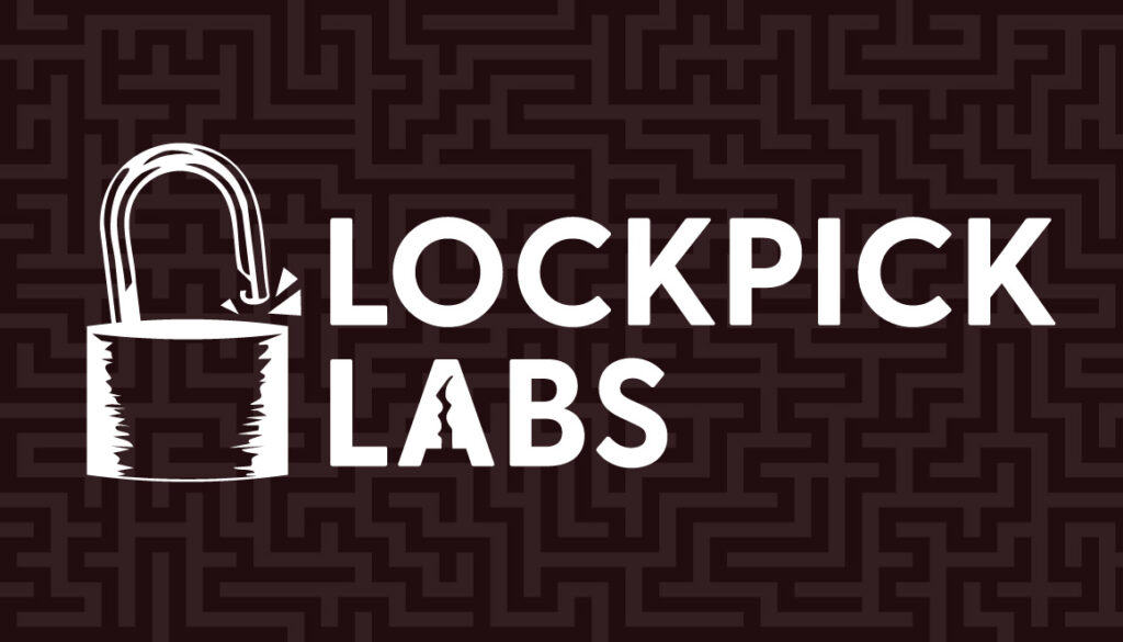
Logo Design
When sketching the logo concepts for Lockpick Labs we had a similar approach to the name, creating several related symbols and graphics to lock picking or escape rooms. Eventually we settled on the broken lock as our symbol.
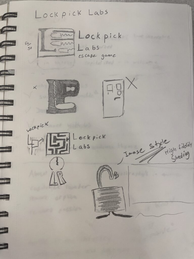
Upon vectorizing the logo we took an images of multiple locks and vectorized and compiled them to create the icon for our brand. After the general shape was made we added three small triangles emanating from the clamp to give the broken lock a sense of action and motion.

The final logo focused on creating a color scheme as well as adding the lock pick to the negative space in the A in labs to make the whole logo, type & icon appear cohesive and intentionally designed.

Brand Booklet
The brand booklet covers the brand look as well as its usages whilst also describing how the business operates and functions as oppose to others of its same service. Built in InDesign to optimize typesetting and page layouts as well as later alowing us to create a print version.
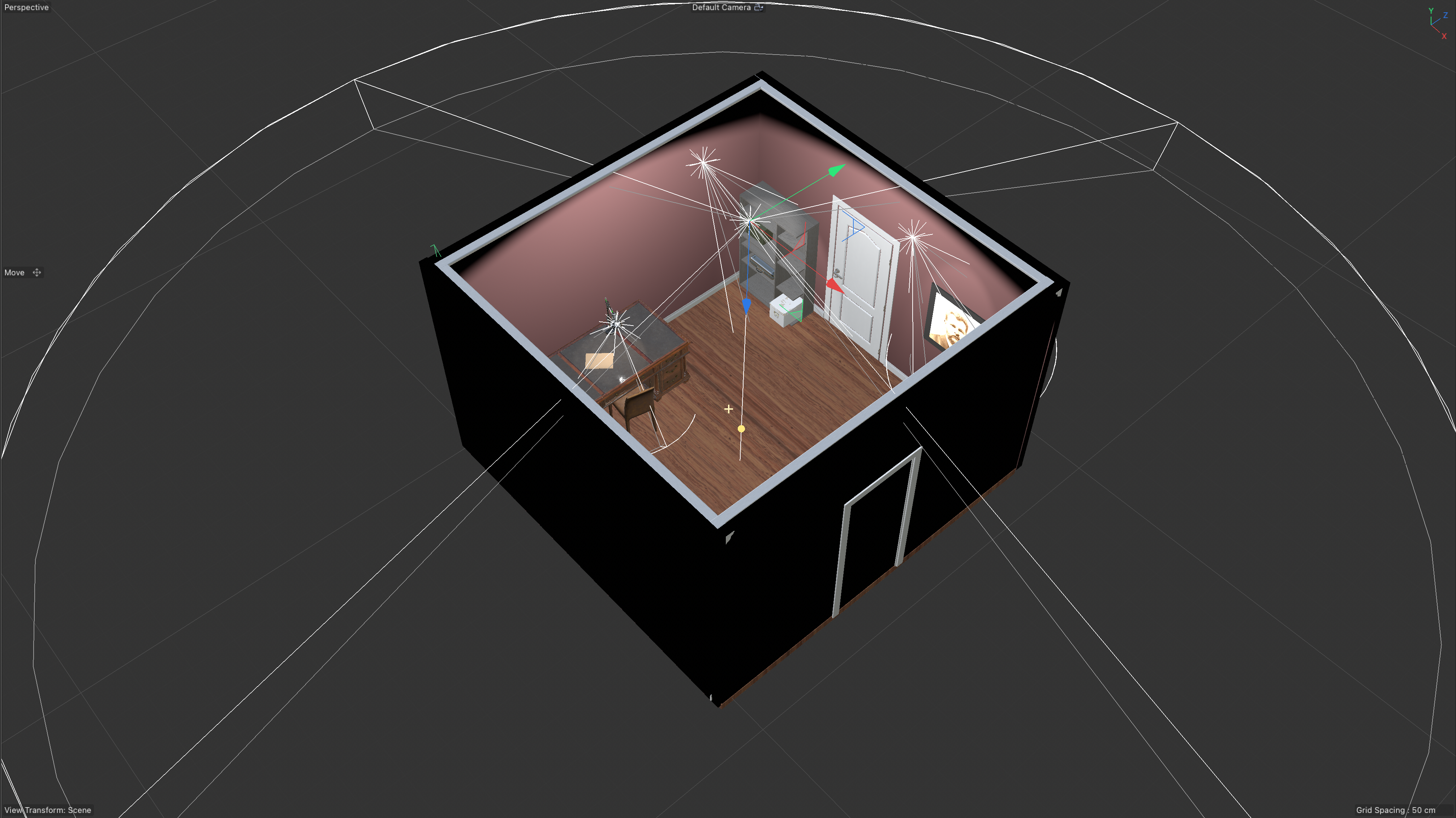
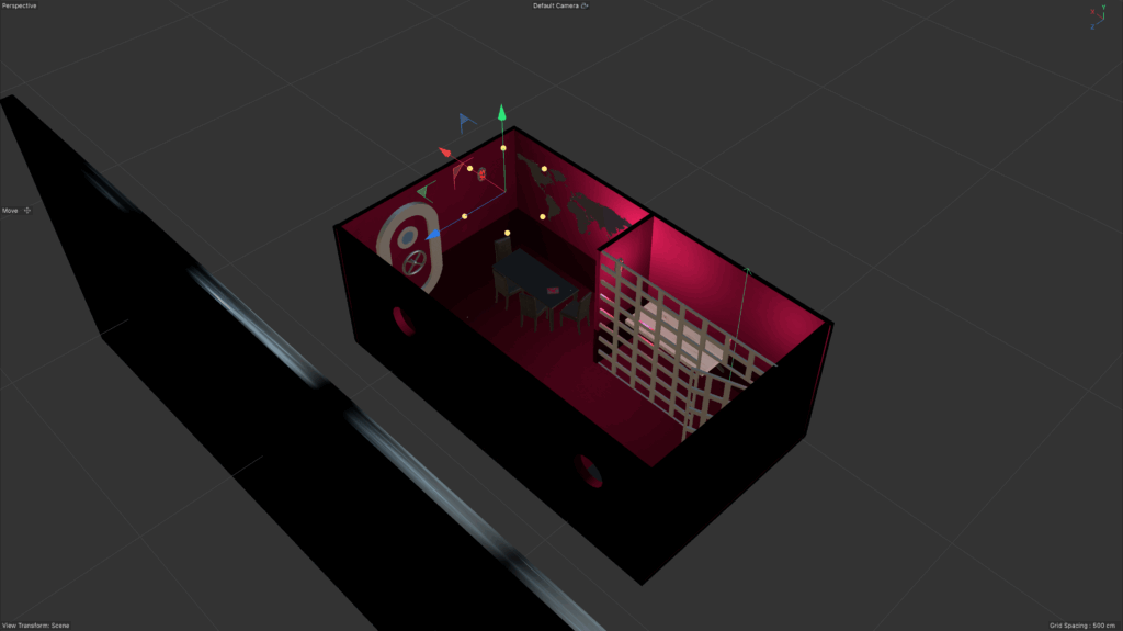
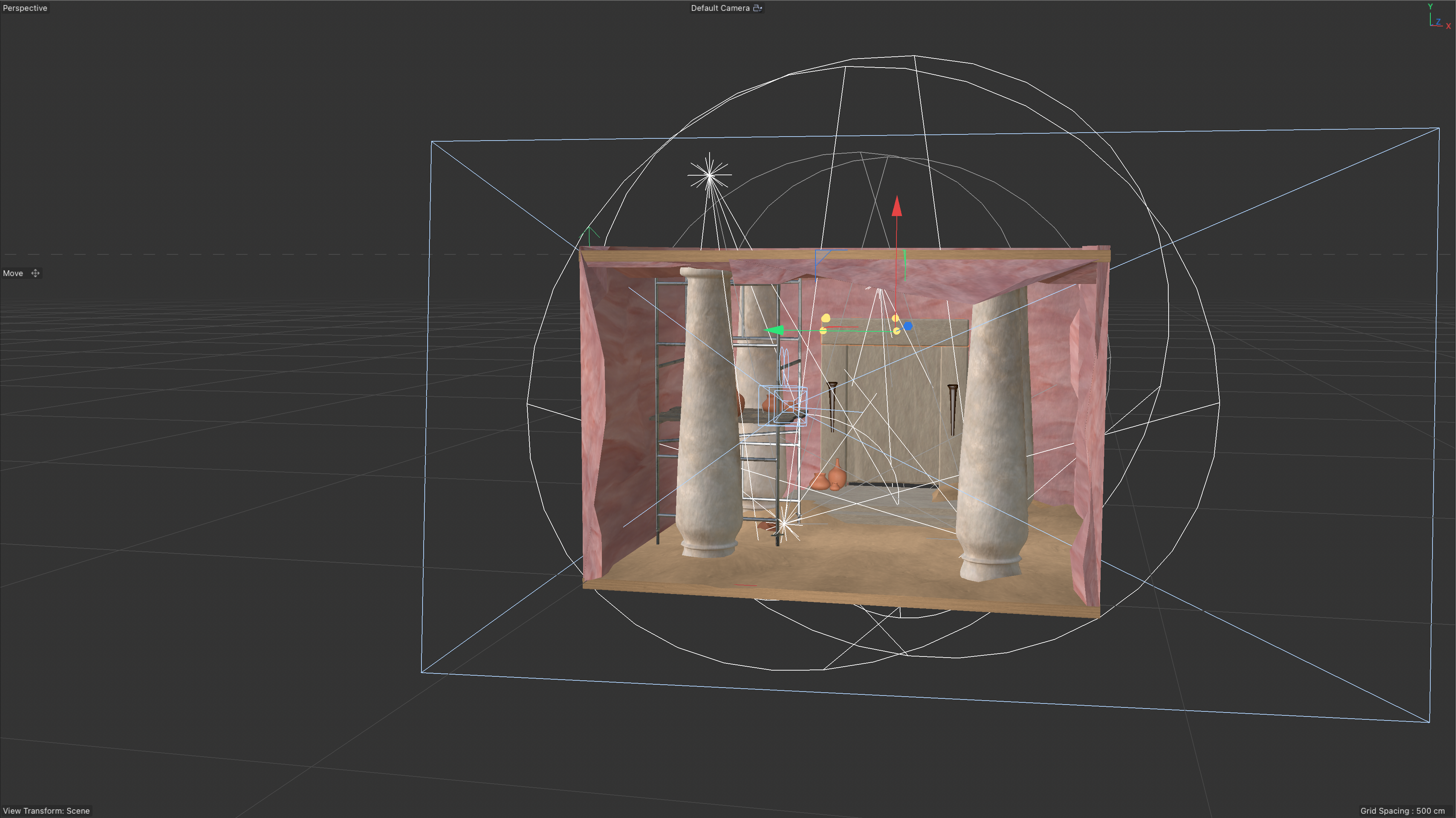
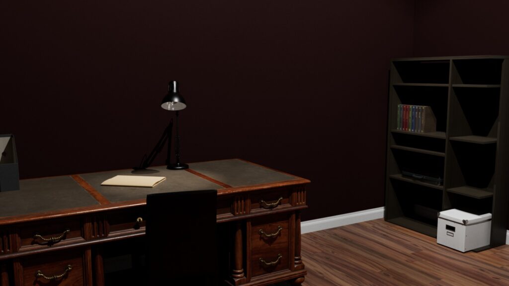
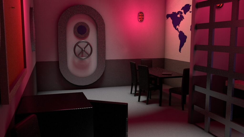
Building the 3d Assets
In the creation of imagery for the lockpick labs location we wanted the visuals to be unique and themed around each room as to not appear bland nor low quality allowing players to get more immersed in the games and their storyline. For this problem we decided to build the rooms in Cinema 4D which would allow us to create scenes for the imagery that would account for both lighting and perspective. The rooms are created of a mix of original assets as well as ones from within cinema 4D’s asset browser to fledge out and give life to the rooms whilst still making time constraints. This of course had its difficulties in making sure all items looked cohesive while still coming from mixed backgrounds, additionally much of the first room had to be heavily optimized for later use in an AR experience.
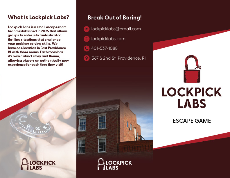
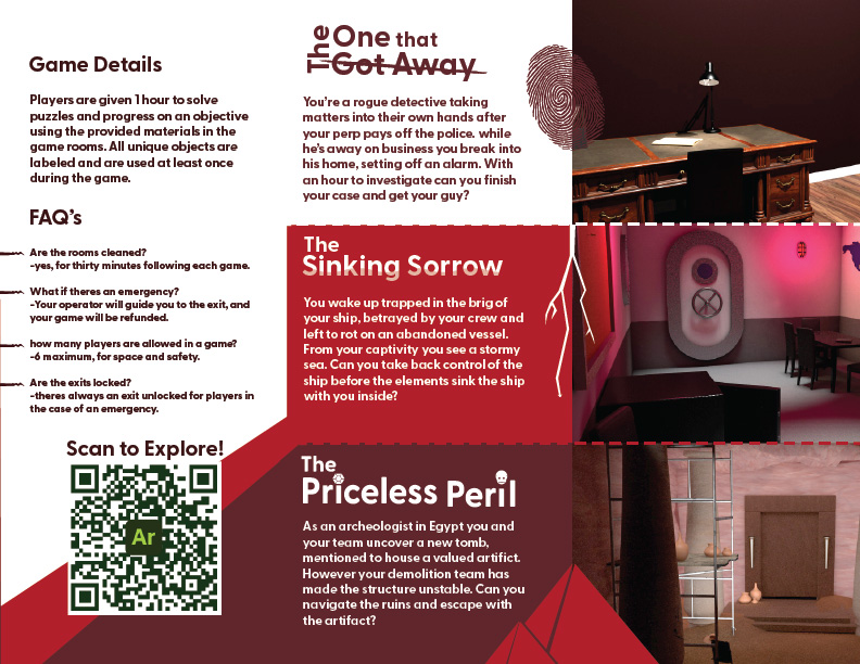
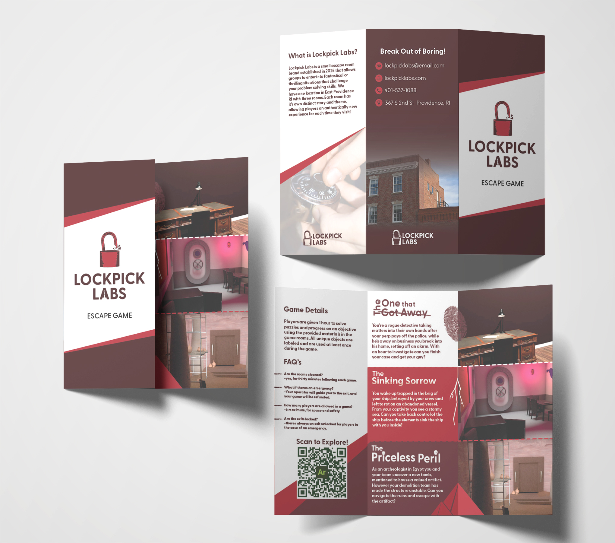
Trifold Brochure
The trifold brochure was constructed to inform and advertise the rooms to our viewer, describing details about how games operate as well as answering general queries about the business. The brochure also describes the 3 escape rooms with the 3D rendered imagery we created to signify the rooms. In the design process we encountered issues with readability in the layout as well as needing to update the titles to create more intrigue for our audience.
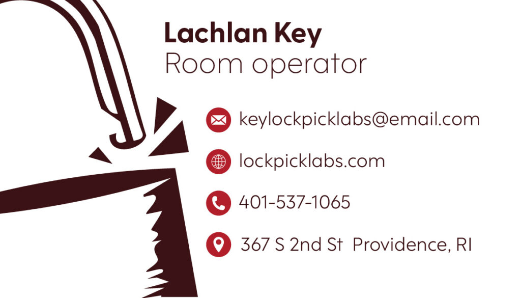
Business cards
One of the employee business cards for Lockpick labs.
Augmented Reality Experience
In creating the AR experience we had to use on of the files we created before in Cinema 4D and optimize its elements to be both interactive as well as sized properly for importing and loading the experience, this involed the minimizing of textures and proper GLTF exports. Once all structures were placed into the experience they were made interactive through tap prompts that would activate animations and audio, giving the viewer a greater sense that they are in the location.
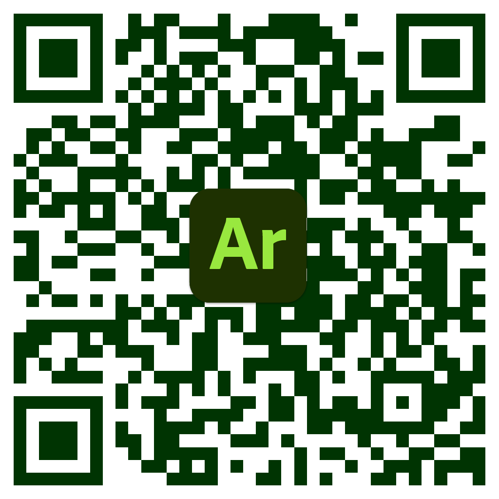
This AR experience (accessed via the QR code on the brochure) would allow viewers to walk through and interact with a space they would be in for one of the escape rooms. The experience places the player in this room where they can interact with furniture and items to move and discover their surroundings. The room gives players a sneak peek into the environment and potential play style of a room. Upon exiting the experience viewers are taken onto the lockpick labs website where they can book a room for a session. This allows the experience to give incentive for viewers to make a purchase.
Scan the below QR code to access the AR experience yourself!