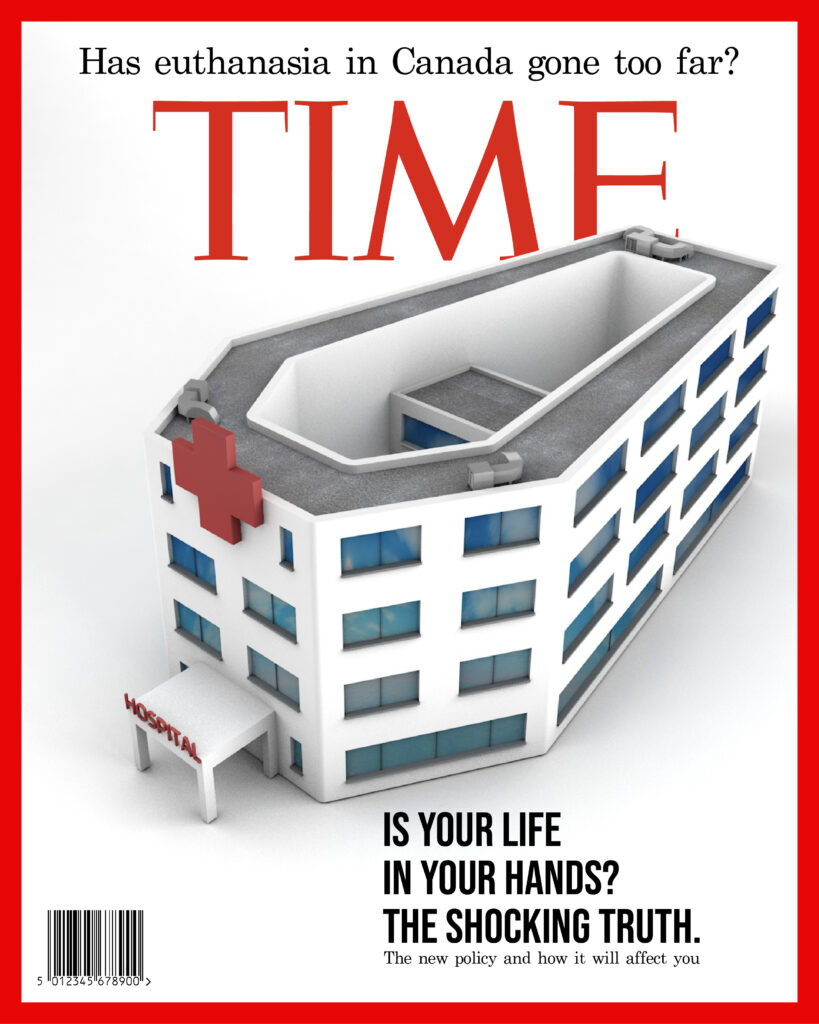
Magazine Cover, for TIME: MAID-Canada’s Euthanasia Problem
audience is king: designing a magazine cover for TIME
Introduction
Tasked with the creation of a 3D magazine cover we were made to research and cover a topic that could be made into a metaphorical magazine cover of our choosing with the applied research of the problem and magazine audience. For our topic we selected the euthanasia policy in Canada as of 2020 that had loosened restrictions on what qualifies for the euthanasia treatment.
Project
-Research target audience
-Define the problem my cover will address
-Create rough concepts
-Polish concepts
-Critique & redesign
-Final result
Target Audience
Who’s reading and why care?
The audience of TIME magazine is 47.69% male and 52.31% female. The largest age group of visitors are 25 – 34 year olds. For the topic of euthanasia in Canada as of 2020 we wanted to target people who are either involved in a medical or social service as well as those who value family and connections because that is who the problem best connects with. By understanding this we can better design to elicit a reaction from this audience and therefore have the design be successful.
What does the audience think and feel?
From the empathy map we can address that the audience is one that prides itself on being well informed and empathetic towards others suffering. The issue that the cover will address heavily involves human suffering and is meant to drive the reader to want to help
in mitigating that suffering and be an active member of that community.

The Problem
Finding something the audience will care about
The topic of euthanasia in Canada is admittedly a dark one that can easily offend if not portrayed in a delicate manner, but in addition to that the desired affect is to still have the viewer have a strong reaction to the imagery that gets them thinking or acting on the subject matter. With this in mind the hope was to use elements that represented euthanasia while not directly tying elements together leaving room for the viewer to digest the message. The goal of this cover is to spur change and expose the limitations that exist within the euthanasia policy such as consent, eligibility, as well as the presence and ability to use other options such as palliative care.

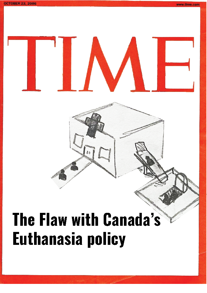
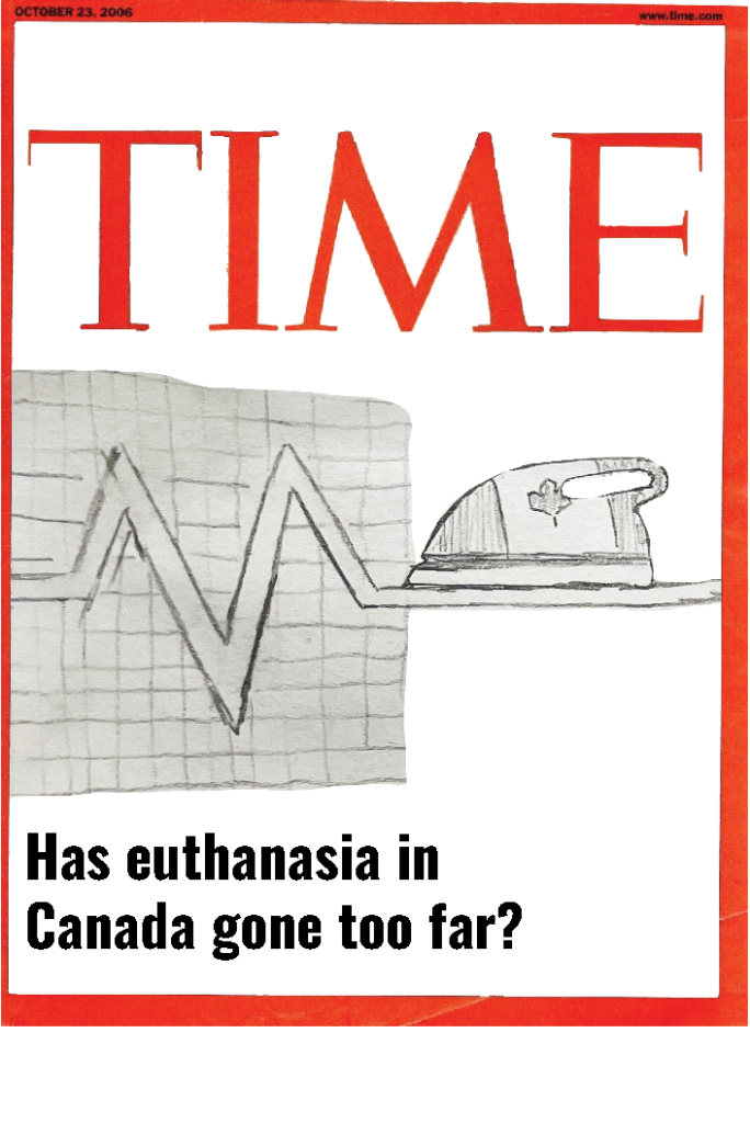
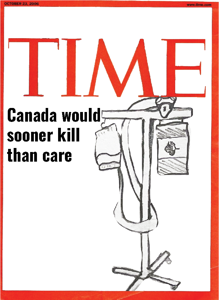
1st Run: Rough Concept Sketches
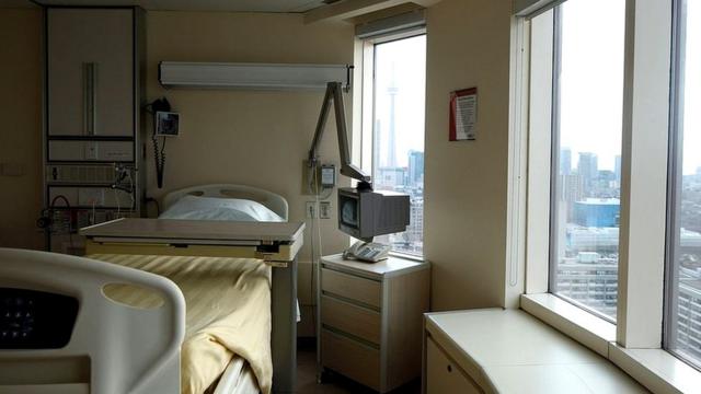
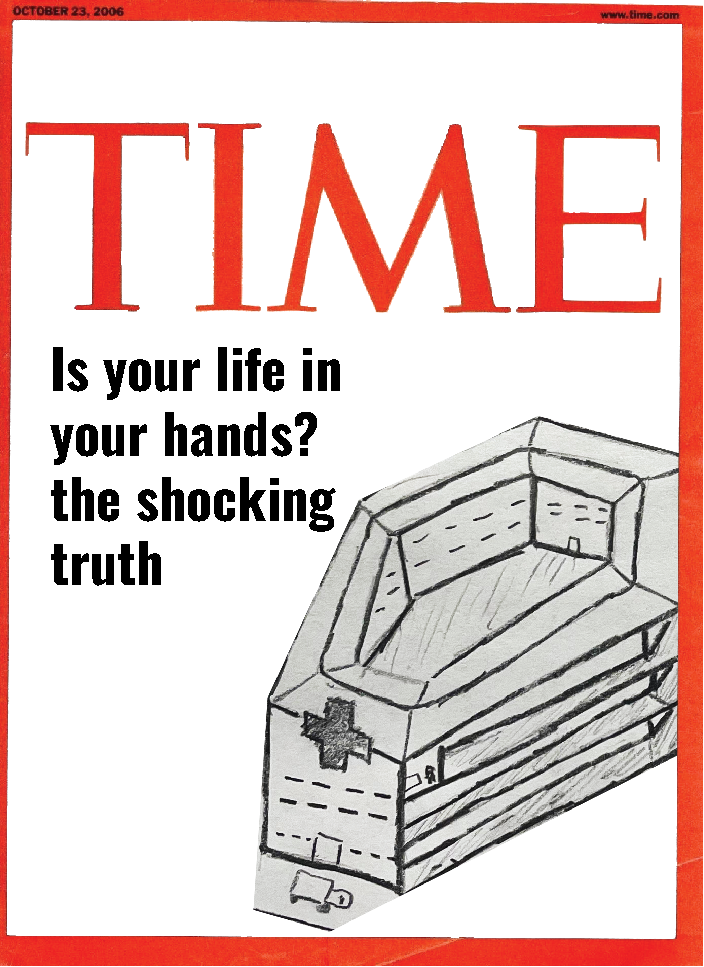
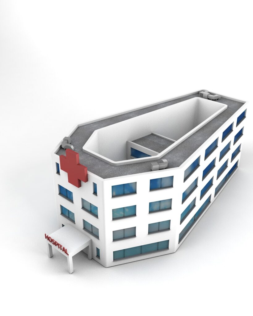
Hospital Room Casket
Hospital room setup that replaces the bed with a casket to represent the true end location that the policy could land a person or their loved ones in.
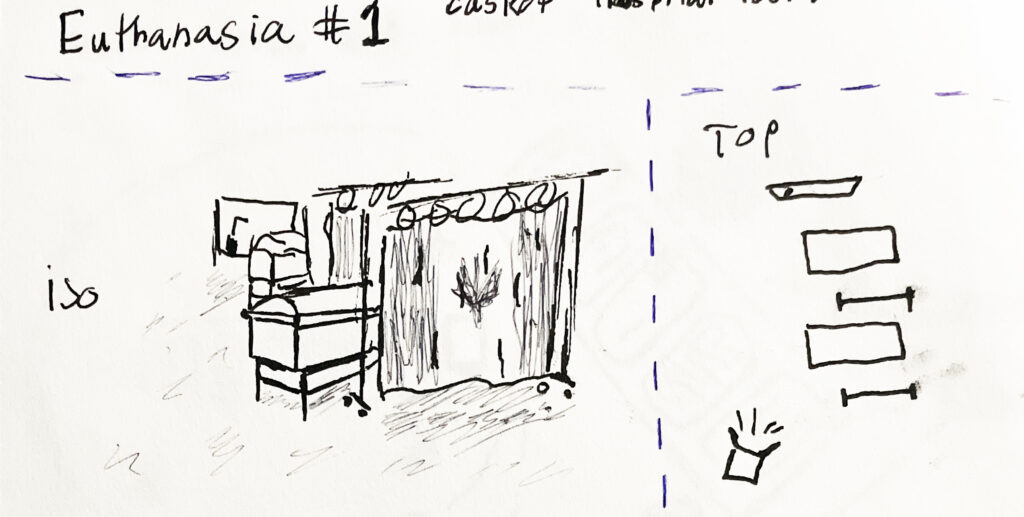
Ambulance as a Hearse
Compares the ambulance a symbol of rescue to a hearse as of the recent policy on euthanasia, instead of leading you to care the take you to the grave.
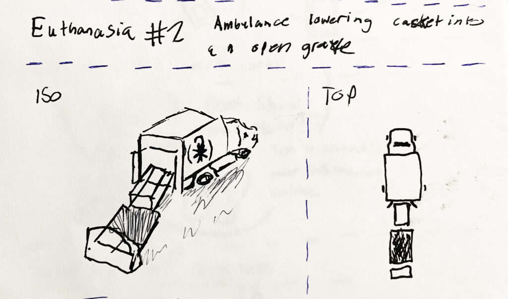
Microwave Dinner Euthanasia kit
Based off of the normalization of euthanasia with the “take home euthanasia kits” that acts as commentary on the absurdity of the object.
2nd Run: Polished Concept Sketches
Improving the image behind my idea
Moving forward with our designs we wanted to maintain the original idea but form it in a way that makes the viewer think more as to be able to change the style to avoid offense as well as deepen the overall concept. Additionally these are designed with the TIME formatting in mind to ensure that each one can be comfortably placed within the frame and still allow for text and other elements.
3rd Run: Critique & Redesign
How viewers interpret and feel about the concepts
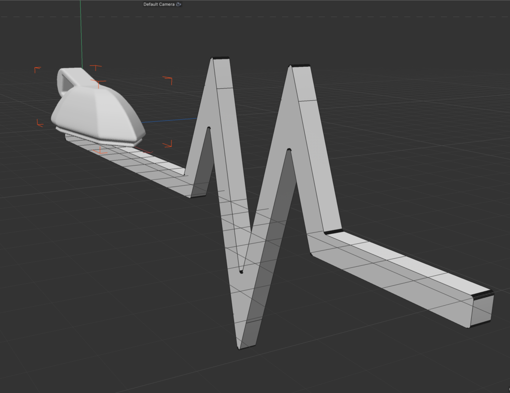
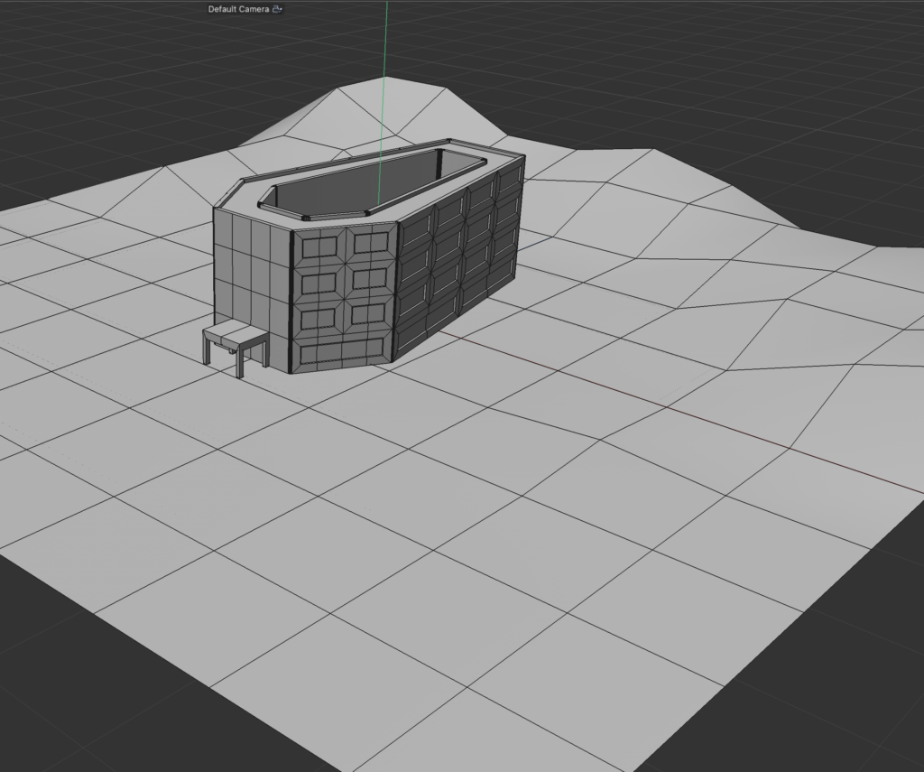
Upon Critique we had honed in on two of the options above, one being the hospital in the coffin shape, and the second being the iron flat-lining a heartbeat. It was decided that both concepts would be loosely modeled to showcase which object would be better in practice.
Final result
How the final developed and what i learned
In developing the final rendering we went with the coffin hospital concept and used an extruded vector to create the base shape and then manipulated the polygons to form the more complicated shapes such as the windows, ledges, entrance, and bridge. Besides those parts we created separate assets for the hospital signage and ventilation systems. After the entire model was built we then moved on to texturing the model which required the use of image mapping for both environment and cubic textures.
Looking back on this project we can say confidently that we can understand the fundamentals of 3 dimensional modeling within Cinema 4D as well as how to properly texture items that are created. Additionally we learned about how important considering the audience is to the creation of the cover to ensure that the message is well communicated and impactful while also not being offensive or jarring.