When Classic Rock meets Modern design
Introduction
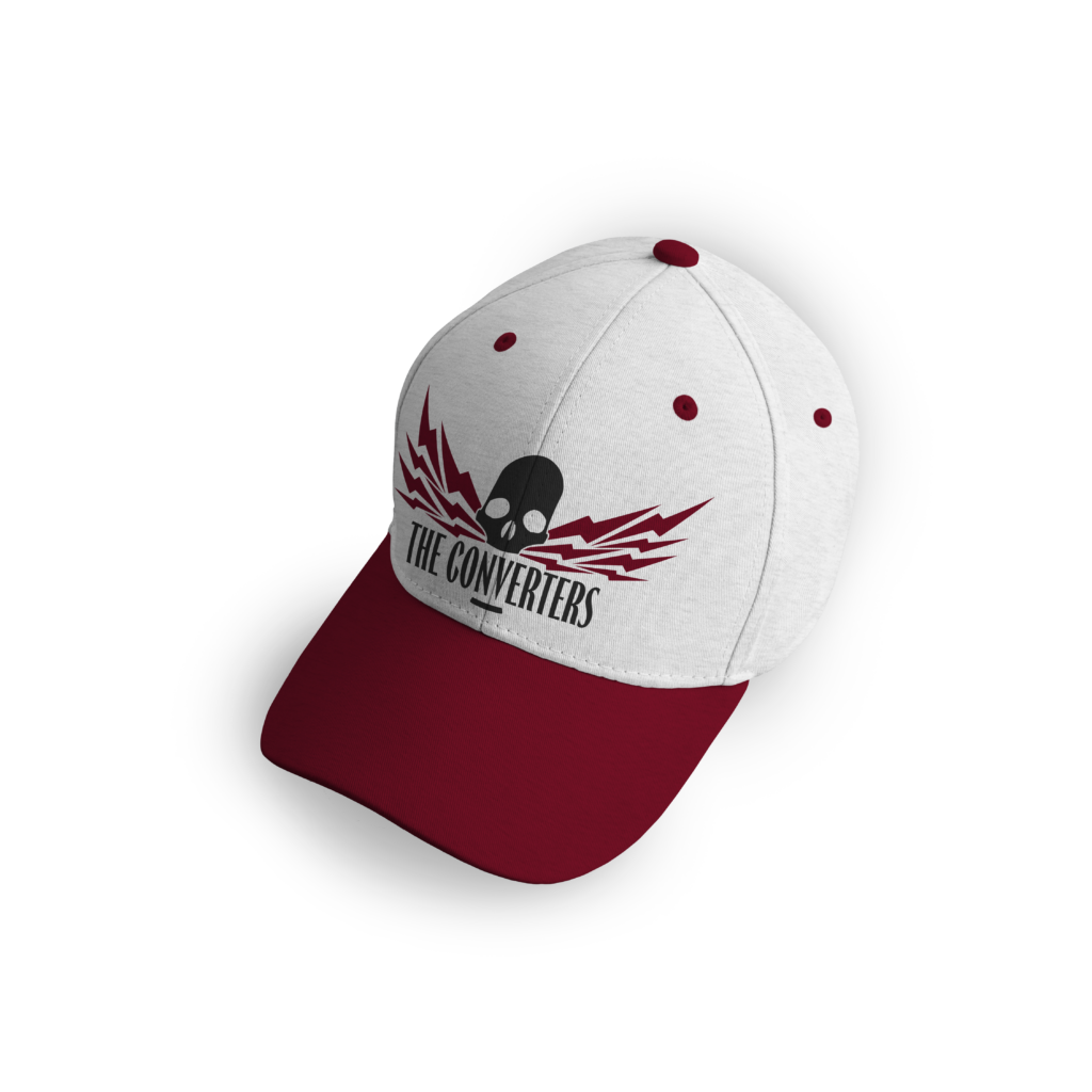
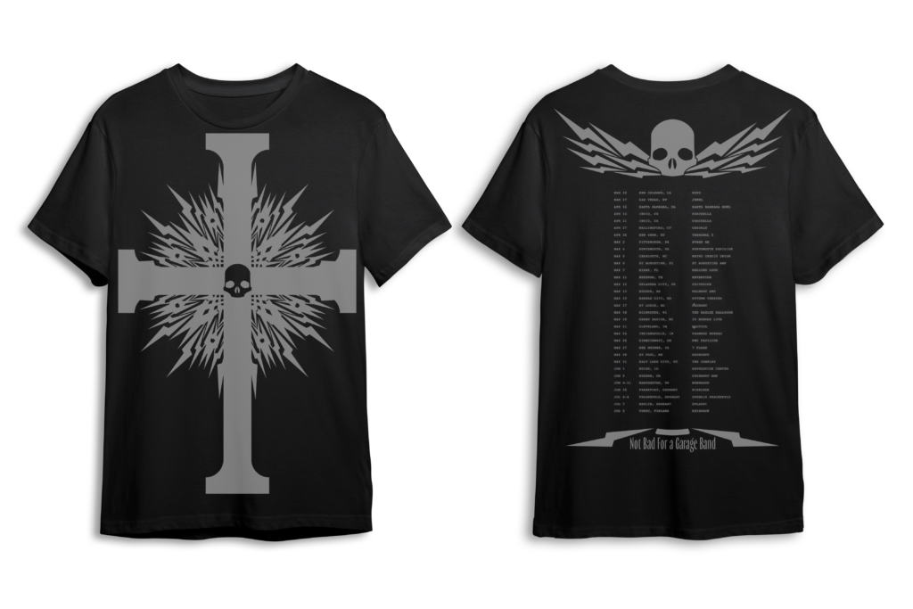
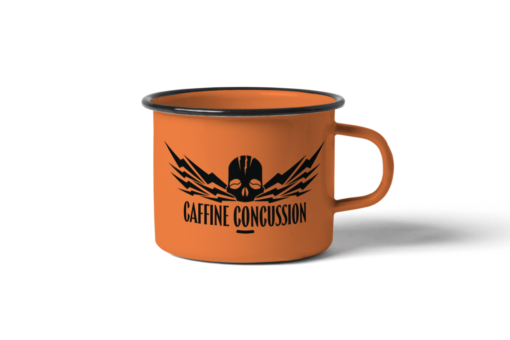
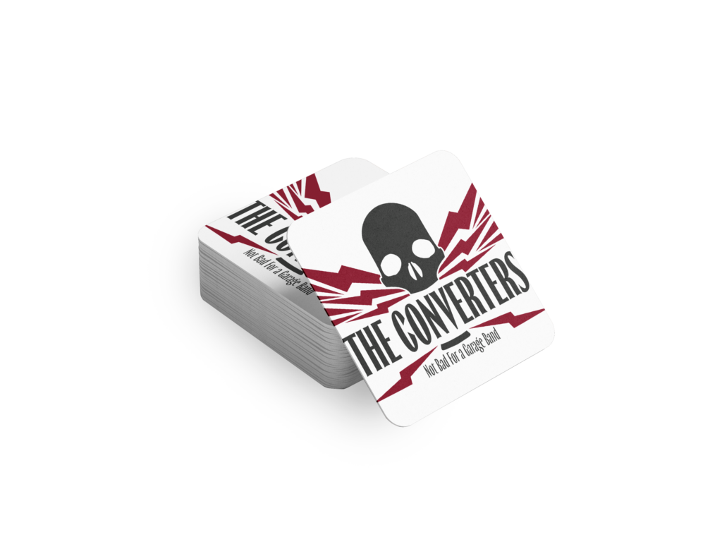
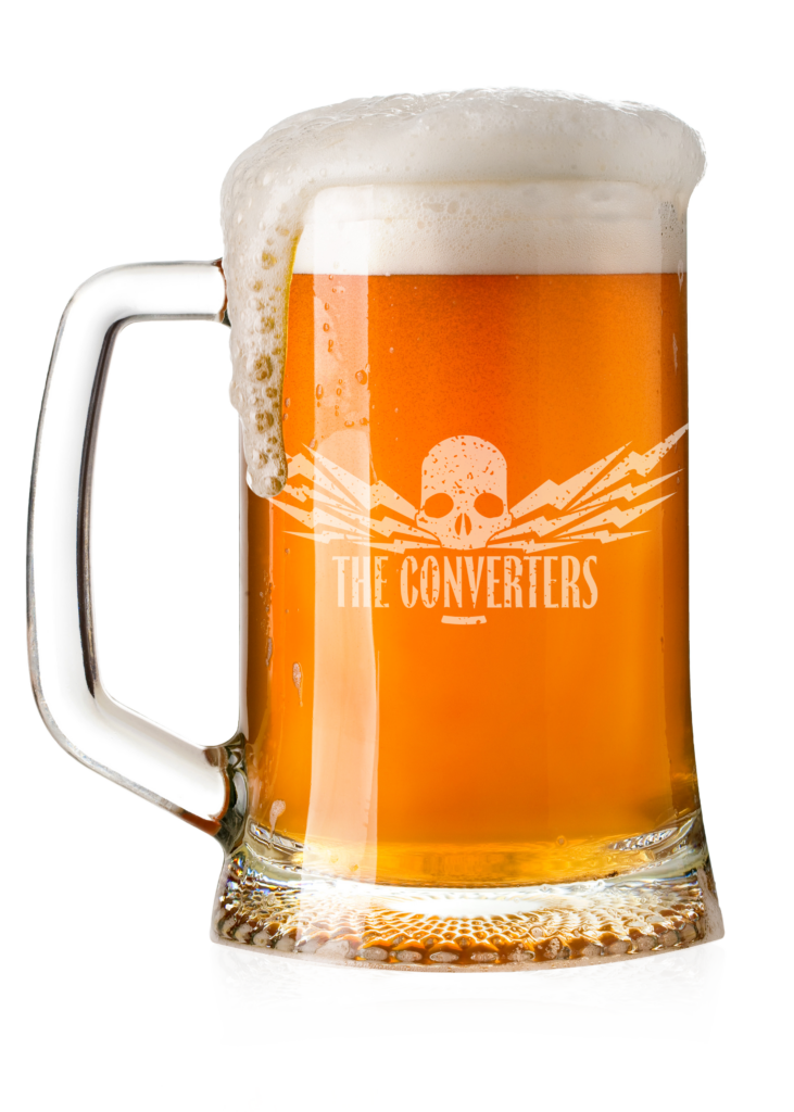
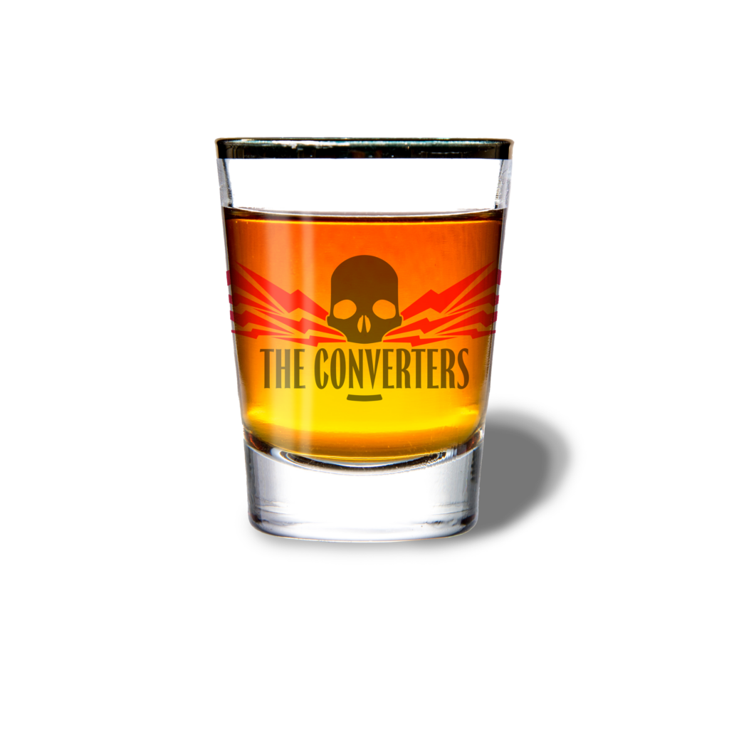
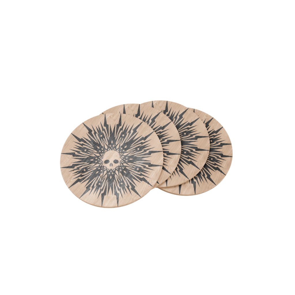
The Converters are a classic rock group that has asked us (theoretically) to create a logo for their band as well as use the logo we create in merchandise for the band. Such items include shirts, hats, glassware, as well as social headers. The project defines an understanding of the culture that surrounds rock & roll as well as those who are avid listeners to create a work that best fits the feel of the client and their audience.
Project
-Research target audience
-Design a logo
-Modify Logo Design
-Create mock up merchandise
-Calculate cost of labor
Target Audience
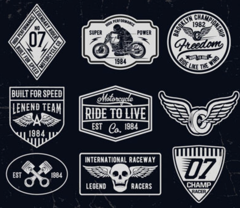
The Converters audience is males and females aged 25-65 that listen to classic rock, for the sake of practice we’ll compare the Converters to Guns N Roses which allows us to theorize what their audience is like. Additionally in the brief it was established that the audience also included people with a biker background and vibe.
Logo Design
Merchandise
