Rebranding our hometown: History & Heritage
Introduction
For this assignment we were tasked with rebranding our hometowns Portsmouth is a small town in Rhode Island that consists of 4 islands and has a homely feel and rich colonial history. Scattered all around Portsmouth are mementos and memories of the past, everywhere you go has a story to tell, but the town does not share this with visitors in its branding. This project works to change that.
The Project
-Research Portsmouth RI
-Design a new logo for Portsmouth Rhode Island
-Create a trifold brochure that informs visitors of the town
-Produce 2 stylized posters for events in Portsmouth
The Logo
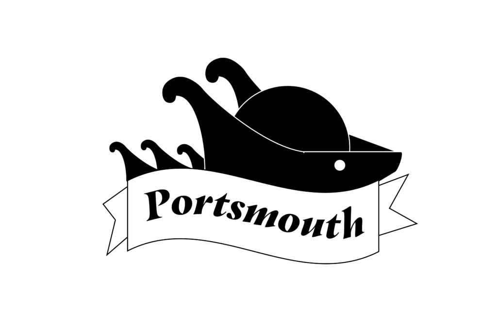
Our first plan for a logo was to mix several symbols relating to Portsmouth into one image. This included waves and the sun coming together to create a tricorn hat.

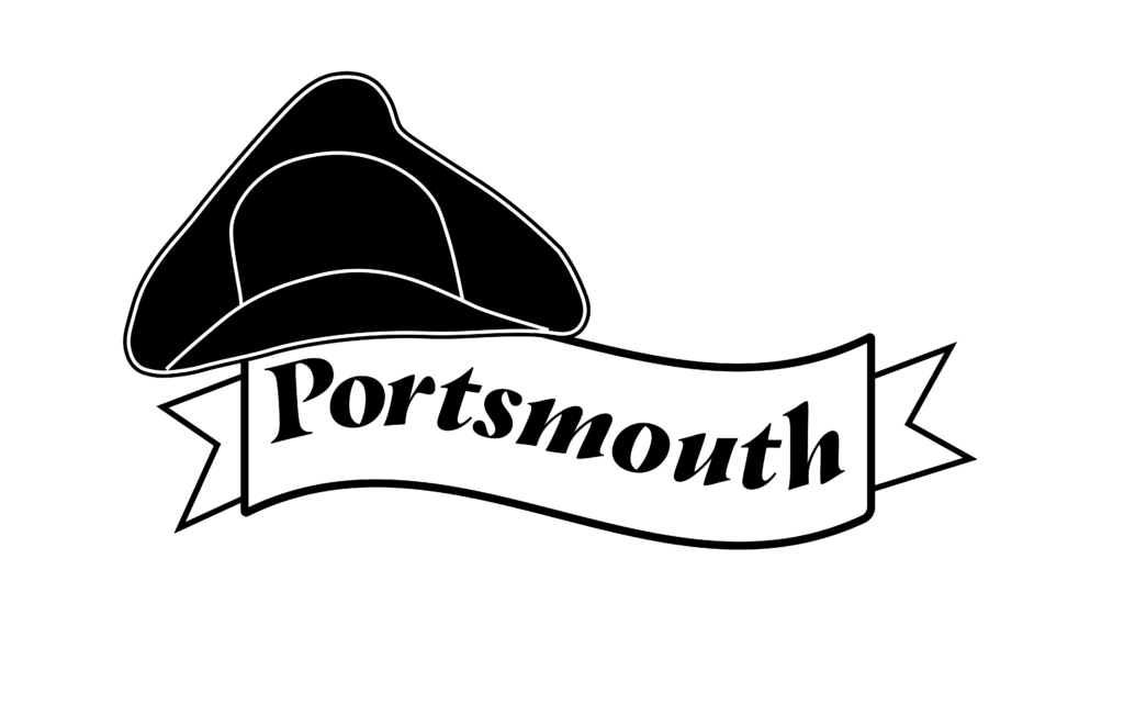
The second design took the combination and made it more directional for text
The third design changed the scope of the project by simplifying it, after all Portsmouth is a simplistic and homely place. We downsized to just the tricorn hat and a banner design where the hat was crooked on the corner of the banner.
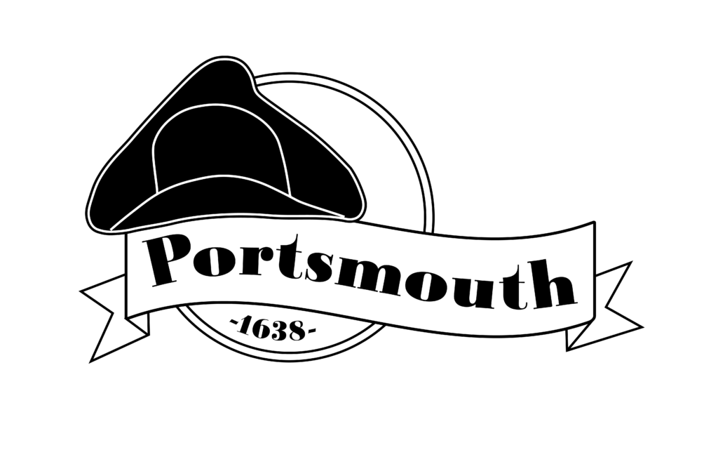
The final design refined the hats’ look as well as added a sun circle around part of the logo that contained the town’s founding date.
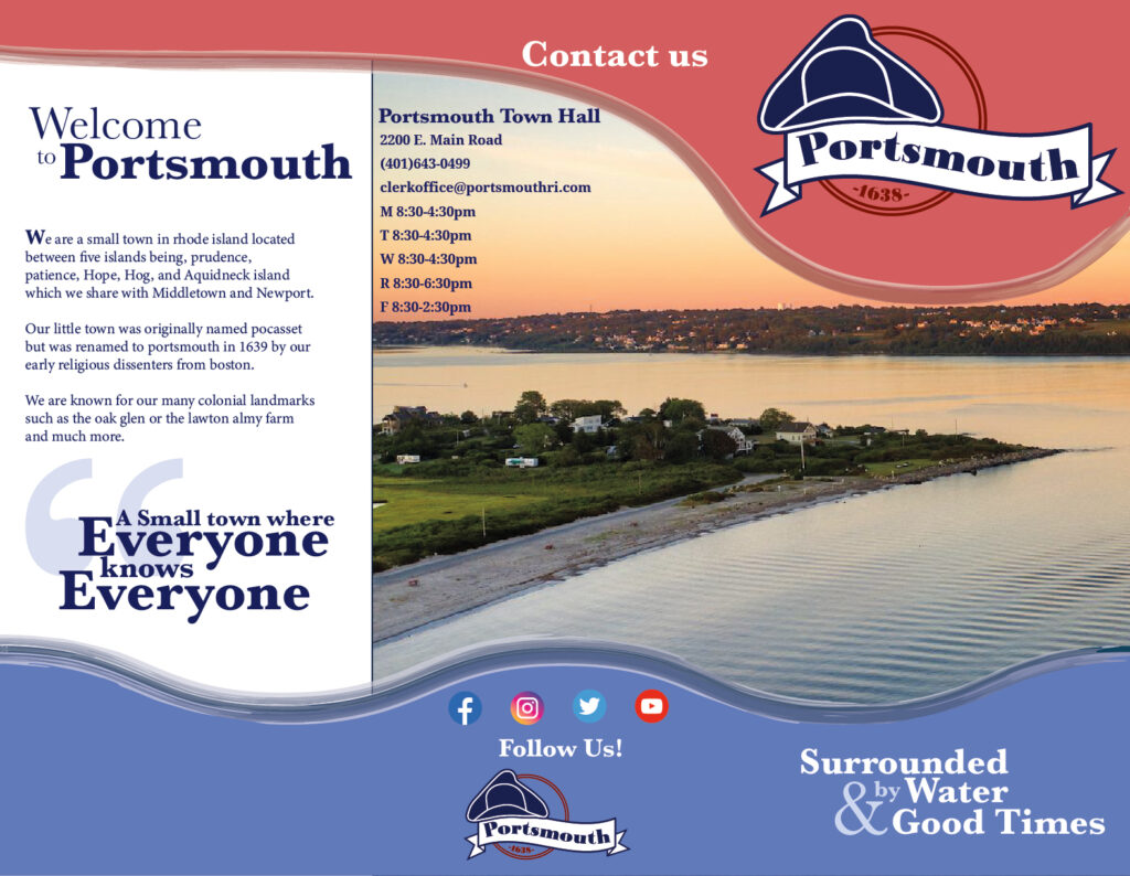
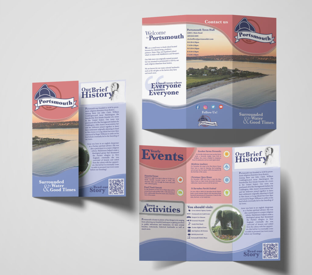
The Brochure
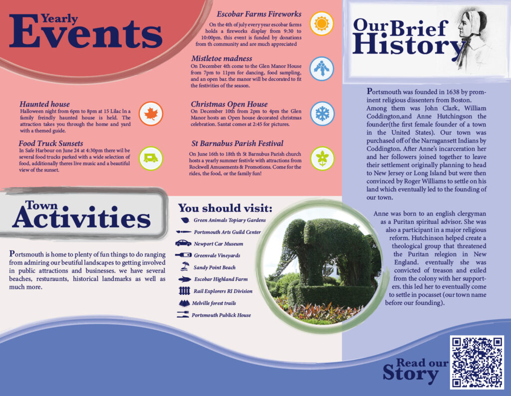
Starting at the front we used a red, white and blue color scheme that is related to Portsmouth school color schemes as well as the towns logo colors to block out space for the logo an image, and a welcoming phrase. The image flowed onto the back of the brochure where the town’s social links and town hall hours cell and address. The inside contained an introduction to the town on the inner fold and then had information on yearly events, activities, and a short history of Portsmouth’s founding by Anne Hutchinson, the first female founder of a town in the US.
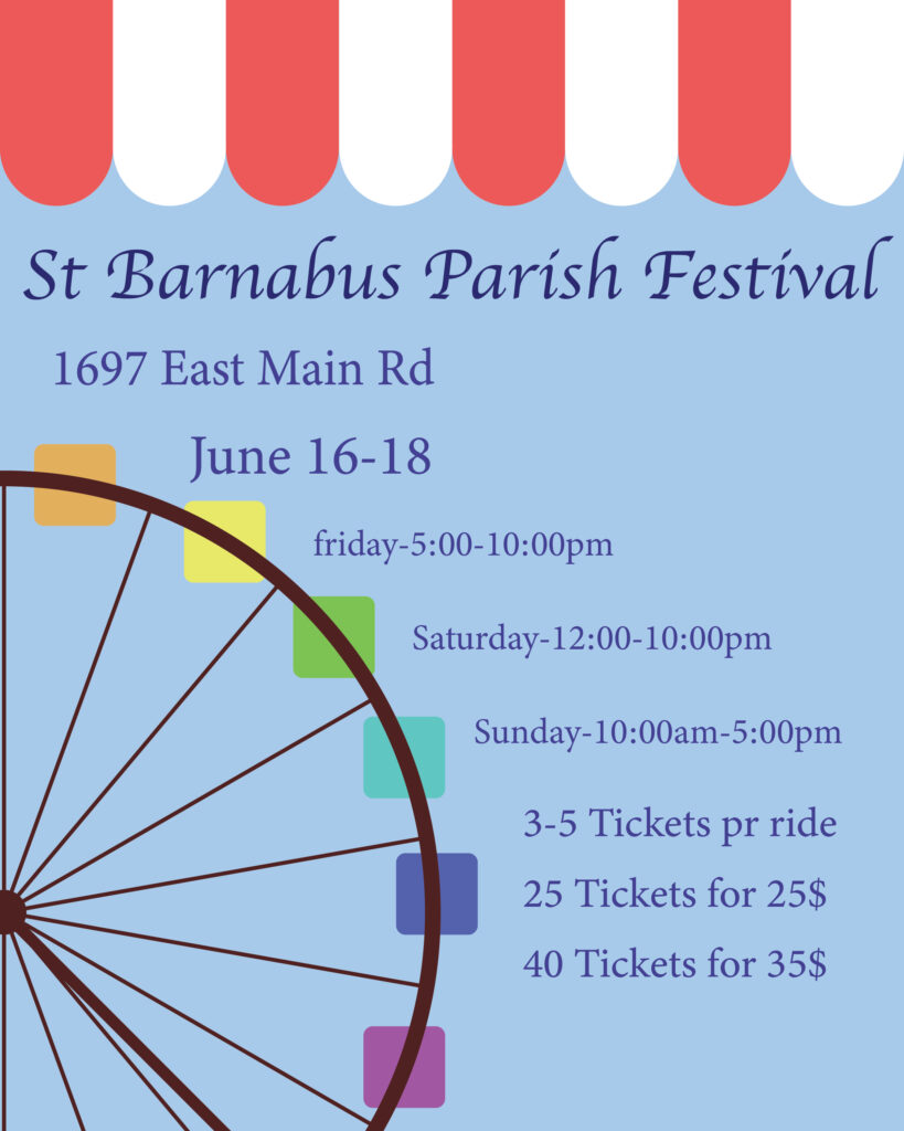
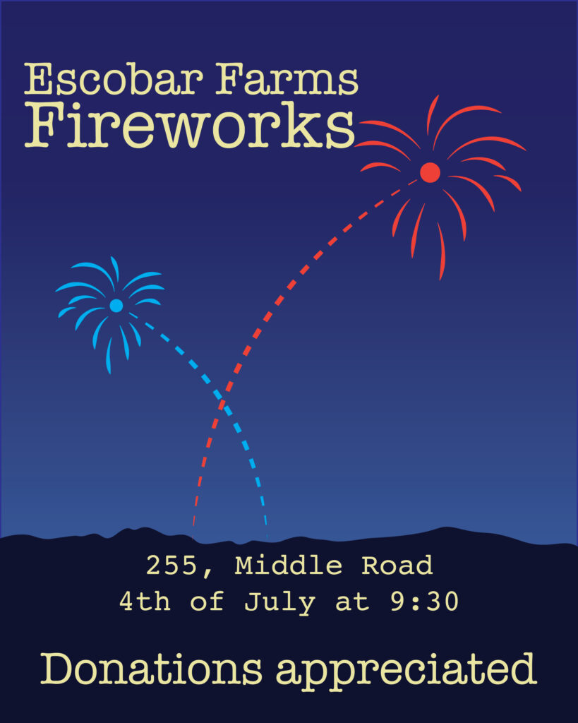
The posters
Each poster design was for its own event but both share design properties such as use of textured backgrounds, flat playful graphics, and a general text hierarchy that values event-place-date-cost-extra because the main purpose of the poster is to attract attention and sell the event. The events used are Escobar Farms yearly fireworks as well as the St Barnabas Festival.