why rebrand the department?
as of right now the GMW department is hard to find and has its difficulties with finding members. additionally the name is long and most people don’t understand what multimedia means. Because of this it is proposed that there will be a name change for the department to “GD” or Graphic design.
concepts that work
To create a proper logo for the department i had to consider, The programs focuses and values, Curriculum, the layout of the building, and finding a white space that works to pull in more students easily.

When sketching ideas i took inspiration from Micheal Bierut’s MIT Media lab logos and their use of grid. I took this idea and mixed it with the fact that a lot of the architecture in NEIT is smooth and curved. so by creating a sharper logo i could catch attention because it breaks the theme of the interior. my final idea involved using a 4×4 box grid that i would fill with triangles to create iconography.

Logos & Icons
I decided that the main department logo should be much clearer so i made the grid 7 boxes long and 4 tall. despite this change the icons remain 4×4 in order to create hierarchy between the father logo and its children, all of which use the same yellow blue color scheme and create either icons or letter-forms to symbolize each facet of the department.
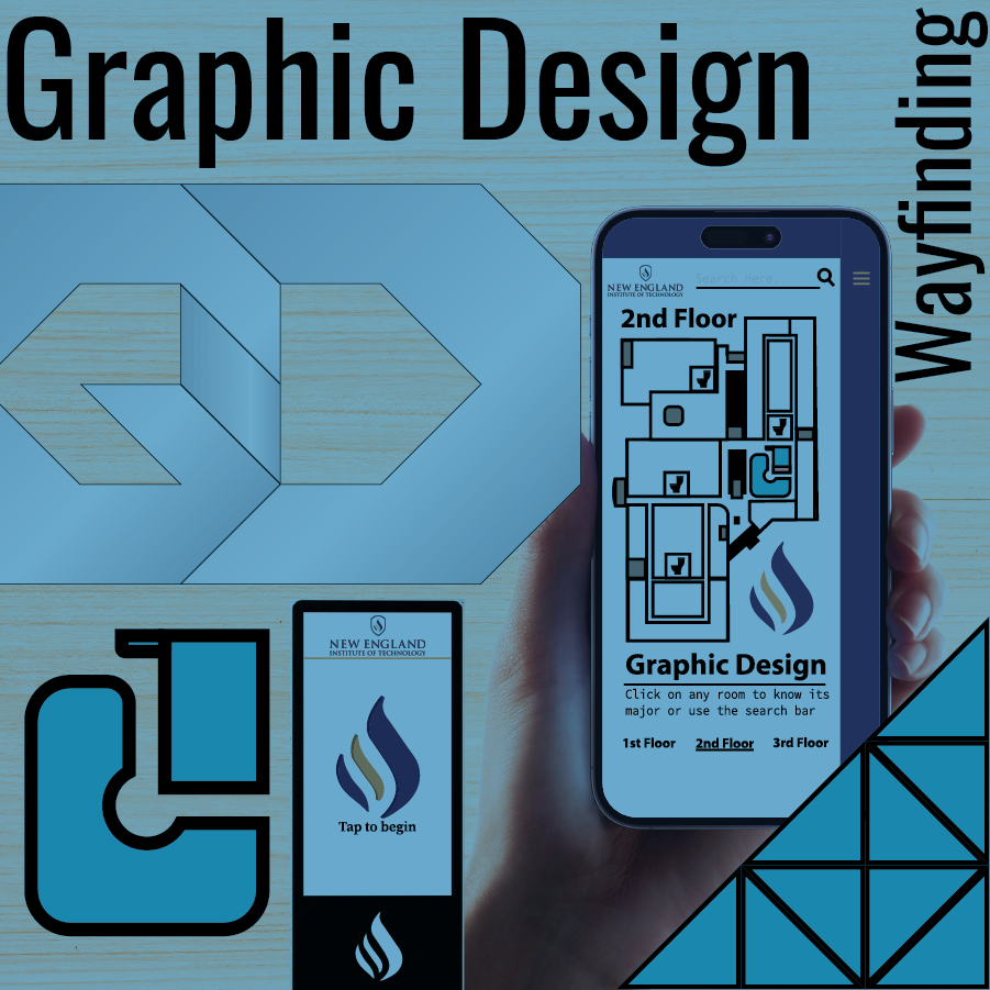
Wayfinding a University
To upgrade the user experience in navigating a university building, such as improving wayfinding for prospective students, the following key steps can be taken:
Conduct User Research:
To begin the wayfinding process first we must figure out more about the user of our navigation. We have to know and understand struggles and pain points that they’ll have upon entering and navigating the building and then build upon this to improve the wayfinding experience and optimize any persons form of travel through the building.
User Journey:
The user begins their journey at either the main northeast entrance which opens to the tech way lobby where there is a large open area of space with several path choices with most of them leading further into the building. going left of the fountain they’ll see a staircase on the right and walk up it. Upon reaching the top of the stairs they will turn left and walk into the two north hallway. Following the left curved wall they eventually reach the Graphic Design department.

Pain Points:
there are many sight-lines and areas that are not clearly marked in a way that allows the user to understand an know where they’re headed which leads to confusion and discomfort in the navigation process.
Set Goals and Objectives:
Create navigational features that will assist the user in navigating the building confidently and comfortably.
Design Clear Signage:

Create clear and intuitive signage throughout the building that uses easily understandable symbols, colors, and labels to indicate the various departments and facilities. Prioritize simplicity and consistency to ensure that the wayfinding signs are easy to interpret.
Digital Mapping Solutions:
by creating a digital kiosk that would be found on all floors we can hope to help users navigating by giving them both a map on the kiosk as well as one on your phone. When designing the kiosk i made sure that anyone could make use of it through event and meal information. the phone map takes on a search bar as well as an interactive tap to see map format.

Enhance Visual Cues:
Improve visual cues inside the building, such as using color-coded floor plans, floor markings, or wall graphics, to visually guide students towards their desired departments. Visual cues can help prospective students understand the building’s layout at a glance.
Provide Information Points:
Install information points at key areas within the building to offer assistance and answer common questions. These information points can be manned by staff or equipped with self-service kiosks containing maps, FAQs, and contact information.
Conduct Usability Testing:
Once the upgrades are implemented, conduct usability testing with prospective students to ensure that the changes successfully improve their experience. Use feedback and observations to fine-tune and iterate the design further, if necessary.
Provide Ongoing Maintenance:
Regularly monitor and maintain the wayfinding system to ensure that it remains effective over time. Fix any signs or interactive devices that may become damaged, update digital mapping solutions with relevant information, and review user feedback to continually improve the user experience.
Process Summary:
By following these key steps, the user experience in navigating a university building can be significantly upgraded, providing prospective students with confidence and a seamless journey to find their desired departments.
