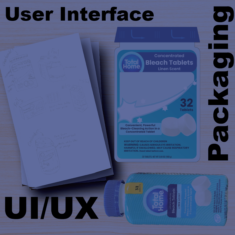

Addressing the problem
Upon looking at the product from a distance it didn’t stand out on the shelf compared to other products of its nature. Additionally the product does not portray clearly that it is a cleaning product and not a pill canister of sorts. Buyers of this product are families who want a quality product that also values safety in the household.
Work shopping a solution
To improve upon the design of the product, I decided to use graphics and visuals that better portray the products use some of these changes included the universal cleaning shine swipe that indicates a cleaning product, on top of that i also made there be a transparent window indicated by the gray that would allow the viewer to see the product inside. Another large change was emboldening some of the type on the bottle because beforehand it took taking an extra look to identify essential information.

